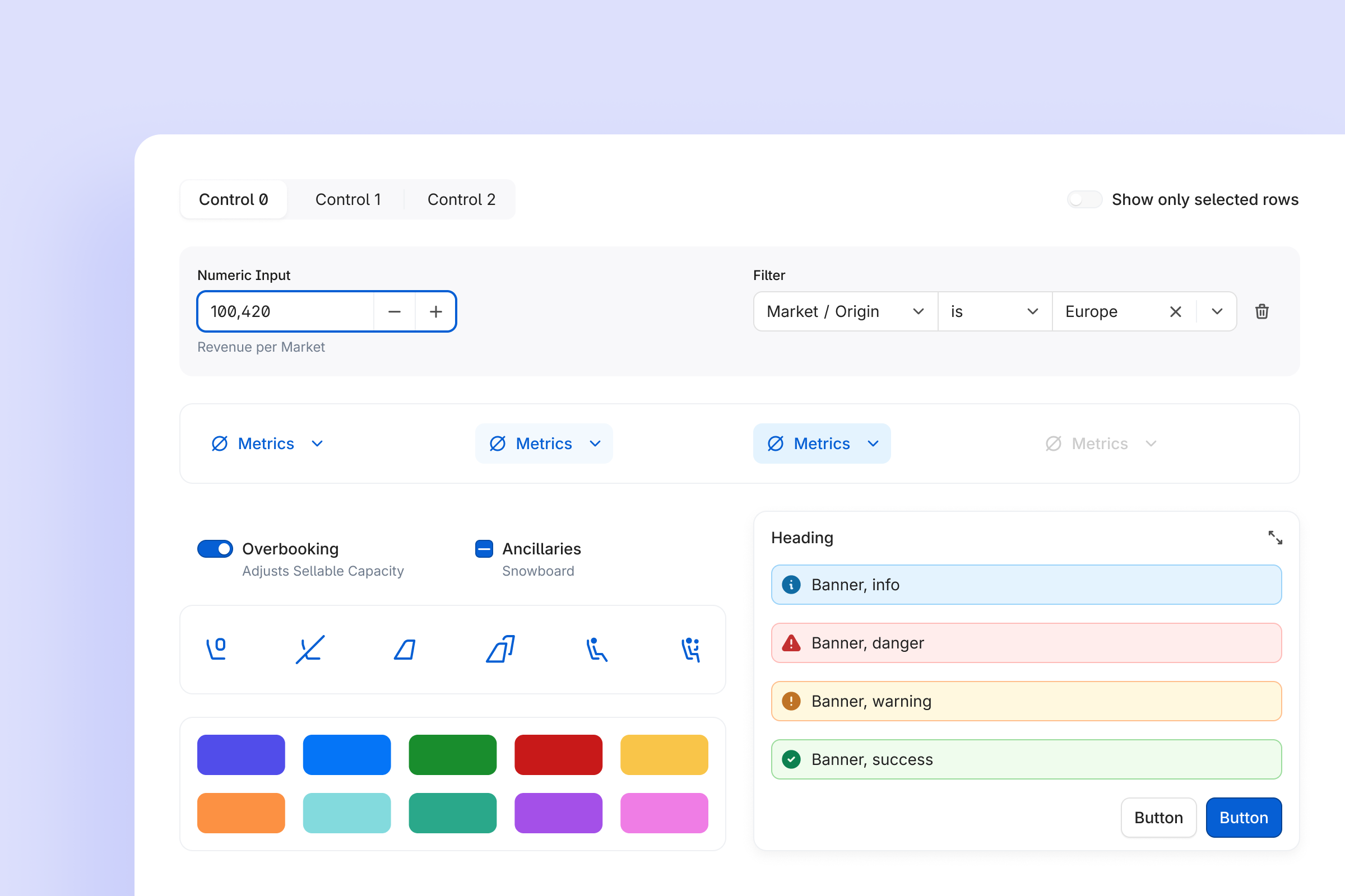
Overview
Over two years, we took FLYR from “every team designs their own buttons and tables” to one shared design system for the whole Revenue Operating System.
- Components & patterns
- 50+ core components in React and Figma
- 80+ patterns
- Fully documented and versioned
- Figma adoption
- 96.6% Figma component insertions
- -31.2% component detachments year-over-year
- Production usage
- 100% product UI in production built on Orville
- ~2k component usages in the codebase
- +50% usages growth over a year
- Riyadh Air impact
- End-to-end booking flow delivered in 6 months instead of 12-18
- Supporting a $295M funding round
Framing question
"How do we turn a pile of local UI decisions into infrastructure that lets us ship new products much faster, without losing quality?"
Problem & insight
What wasn't working
In 2021, every FLYR product team designed its own components. Each new flow meant:
- Rebuilding basic UI like tables, filters, and forms from scratch.
- Different spacing, color, and state conventions on every team.
- Manual syncing between Figma and code, with no single source of truth.
- Noticeable UX drift between products in the same ecosystem.
For the business it meant slower launches, higher maintenance costs, and no coherent "platform" story to sell.
What I saw
My users here were internal. Designers spent weeks rebuilding basic UI instead of solving real user problems. Engineers cleaned up inconsistent patterns from every team by hand. And without a shared vocabulary, even talking through a UI decision was hard. Three principles came out of that:
- Simplicity
- fewer custom one-offs, more reusable building blocks.
- Consistency
- the same pattern behaves the same way everywhere.
- Control
- the design system team guides, not blocks, with transparent evolution paths.
Goal
Turn those one-off UI decisions into shared infrastructure, so teams stop rebuilding the basics and ship faster.
Building Orville
Foundation
I started by setting the system's boundaries and mission:
- What "design system" means at FLYR: the official story of how the company makes digital interfaces.
- Which standards, assets, and processes must be shared across the organization.
- Which deliverables and metrics will define success.
Then the basics every product would share:
- 4pt grid for spacing, sizing, and radii.
- Color system CAM02 (Ch) to ensure perceptual consistency in real-world lighting conditions.
- Typographic scale and system fonts.
- Three-layer design tokens, synchronized between code and Figma Variables via Token Studio.
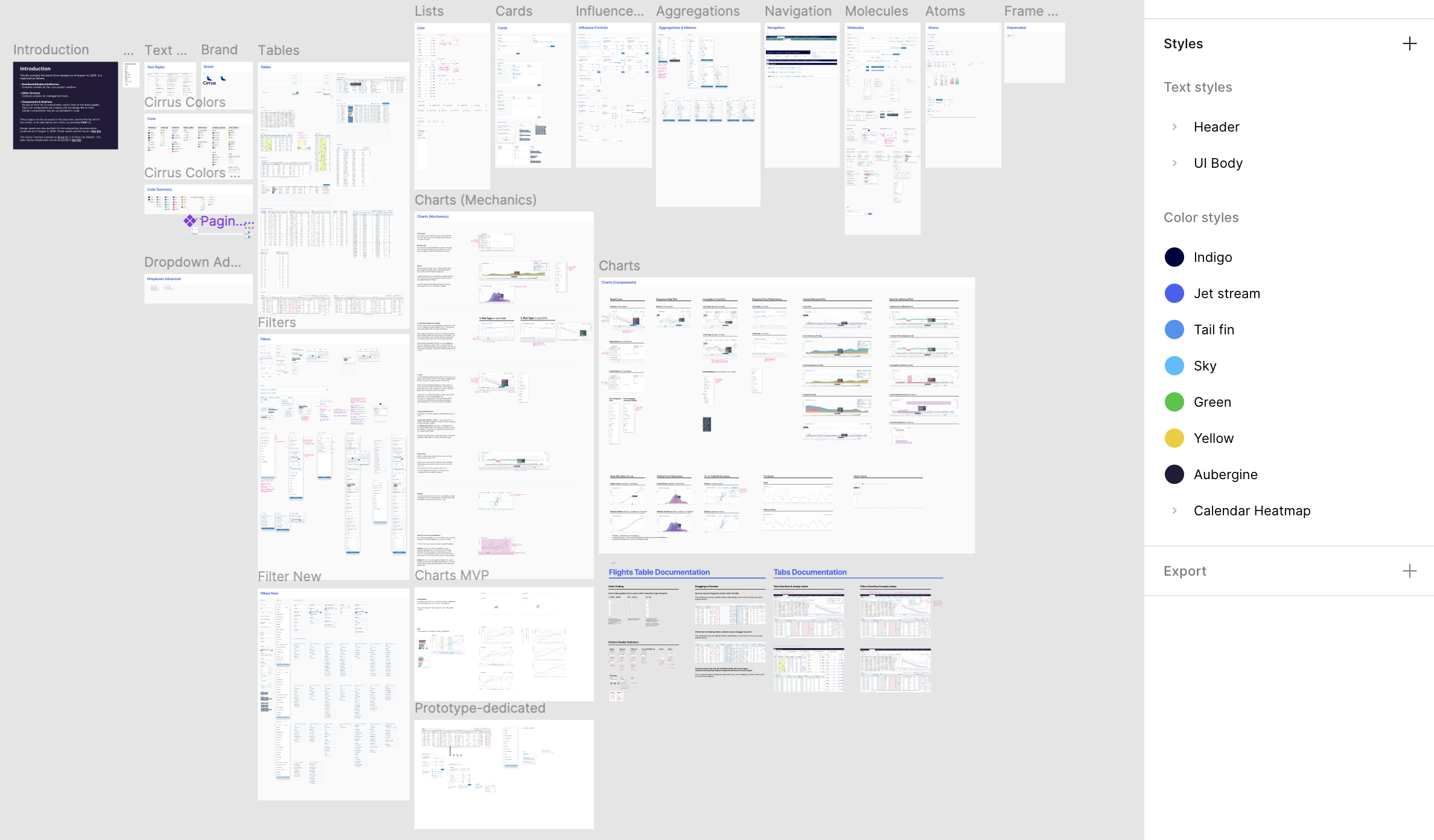
The structure follows atomic design: tokens feed icons and components, which build up into atoms, molecules, organisms, layouts, and pages. I split the master file into three Figma libraries that version on their own (Style, Icons, Components), and together they make up the Core DS that every other team builds on. Two more layers sit on top: a 380+ icon set based on Tabler and extended for airline and B2B cases, and a set of data-heavy patterns (charts, tables, graphs) with accessibility built in.
The master file split into focused libraries (Style, Icons, Components), alongside per-product and per-pillar libraries such as Highcharts, BuildCurves, Charts, and Filters.
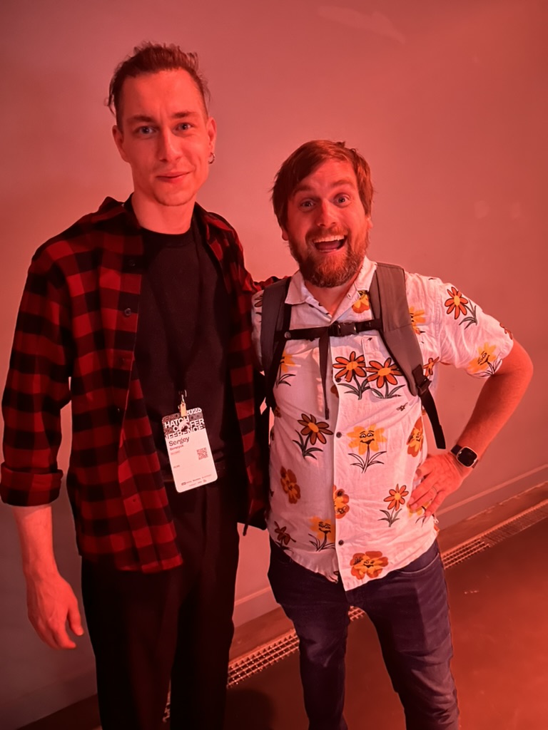
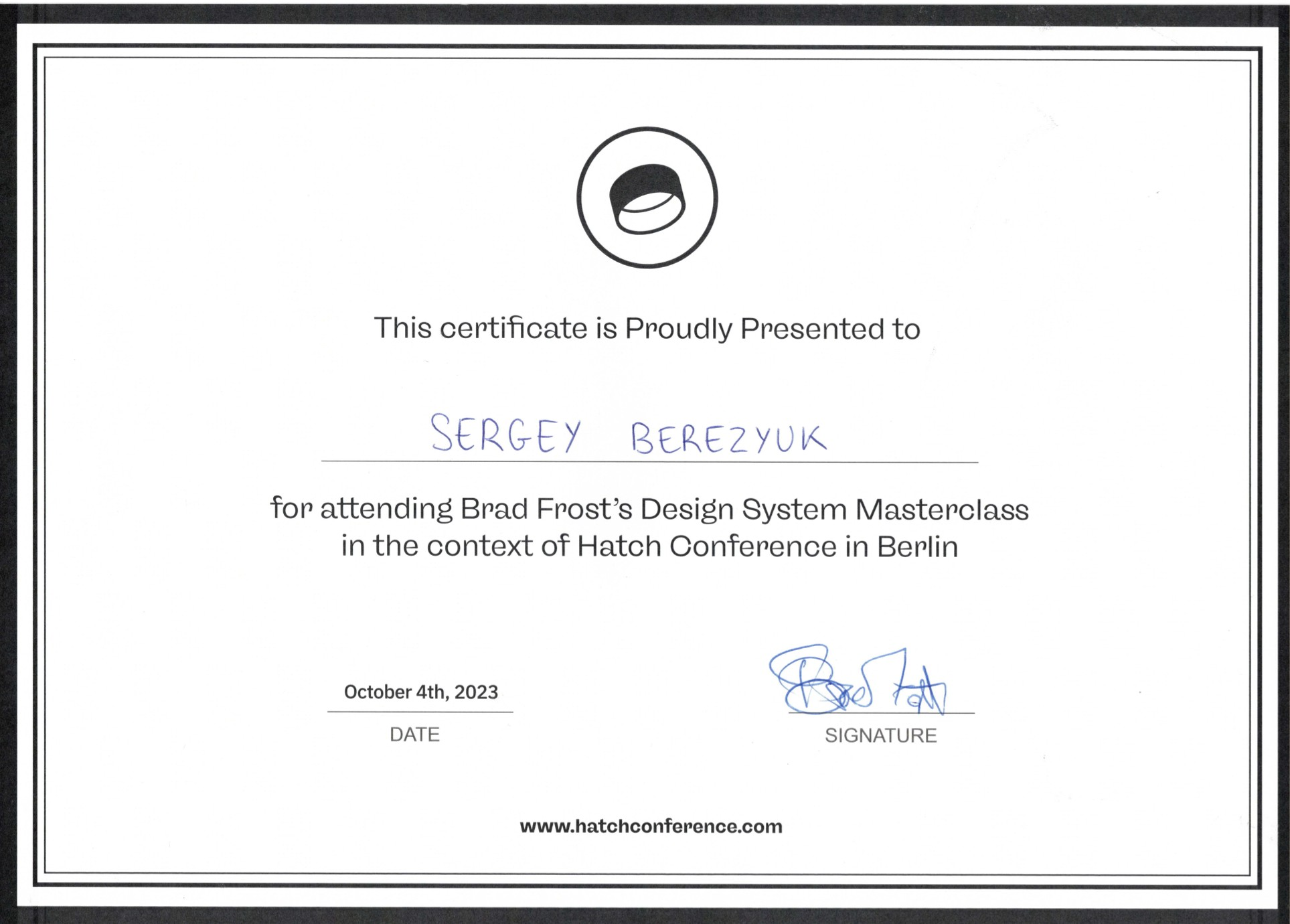
I pressure-tested a lot of these architecture calls at Brad and Ian Frost's live Design System masterclass (Hatch, Berlin, 2023) and their Subatomic course on design tokens.
Layered Storybooks
The Main storybook brings the whole system into one view: the Core DS at the base, and each product and feature storybook layered on top where it made sense. Every product and feature reuses that same core.
- Design Tokens
- Icons
- Components
- Patterns
- Local Components
- Assemblies
- Patterns
- Layouts
- Pages
A shared component language
I turned UI choices into a structured language, spelling out every component's states, slots, intents, objects, and grades:
- State
- rest
- hover
- pressed
- dragged
- State
- focus
- disabled
- read-only
- inactive
- Slot
- trailingVisual
- leadingVisual
- icon
- text
- Intent
- neutral
- primary
- success
- danger
- warning
- Object
- bg
- icon
- text
- border
- shadow
- Grade
- min
- weak
- medium
- strong
- max
That took care of a lot of "which button do I use here?" guesswork and cut the random variation in the UI.
Built for how each role works
I mapped how each role actually works with the system. That is what turned Orville into a product people relied on, not a library they ignored:
Designer
- discover component
- understand guidelines
- assemble flow from existing blocks
- raise a contribution when something is missing
Engineer
- find implementation
- inspect prop API and states in Storybook
- implement without manually translating from Figma
Product
- understand system capabilities and constraints without diving into Figma or code
Shipped in React and Figma
Orville ships in two forms. Design: a Figma library built around real product scenarios (Accordion, Table, Button, Checkbox, SegmentedControl, and so on). Code: React components documented in Storybook and tracked with omlet.dev. Using it is meant to be boring: import, wire it in, test, ship.
Process & documentation
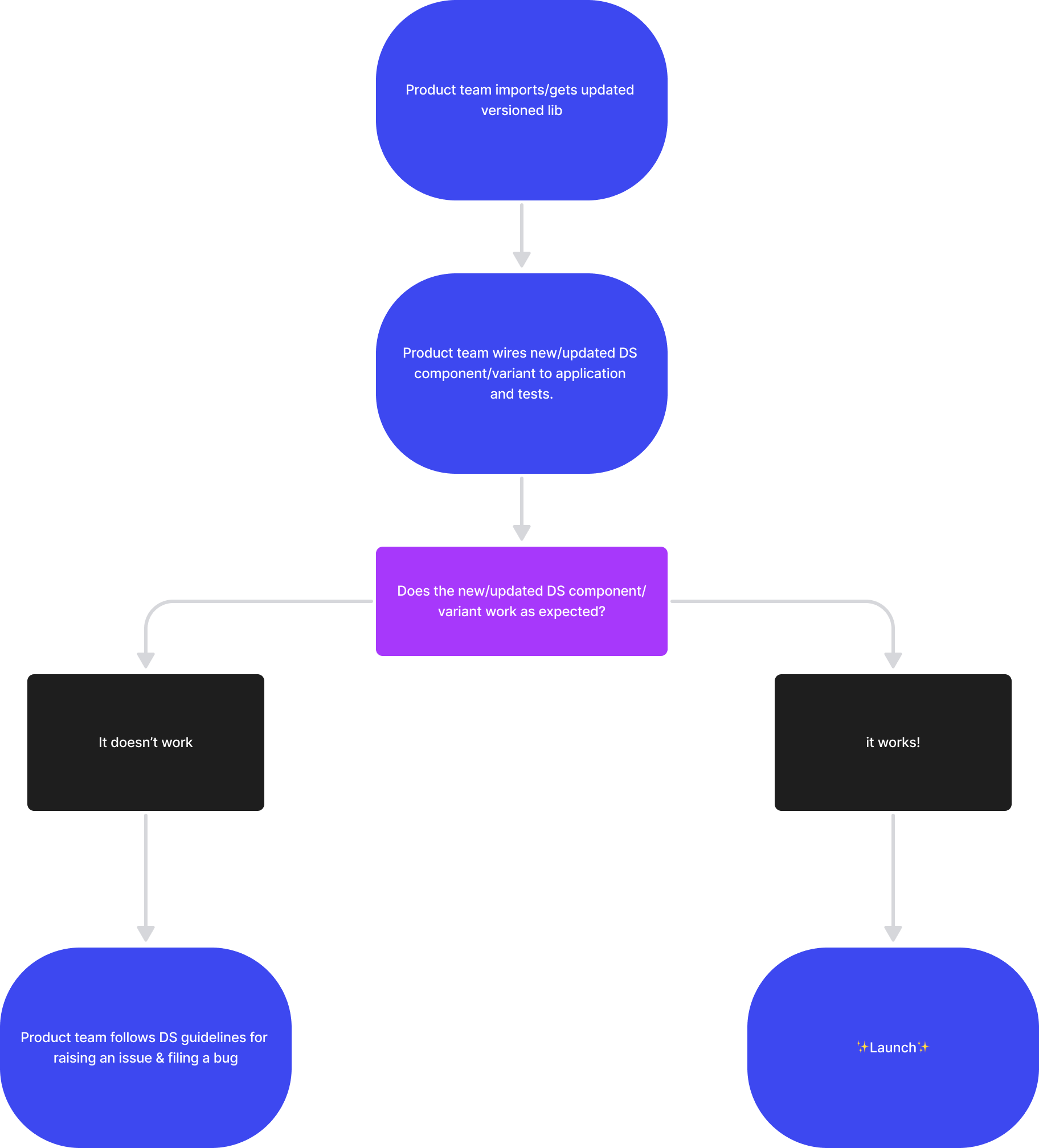
To keep the system growing instead of going stale, I added contribution templates for components, properties, and icons, and pulled the documentation together across Confluence, Zeroheight, and Storybook, all searchable and versioned for designers, engineers, and PMs. The intake-to-release path puts a few questions in front of every request before any code gets written: does the component exist, does it meet the need, does it belong in the DS, and can it hit the timeline.

Transparent, defensible prioritization
With 10 designers and 50+ developers depending on the system, informal prioritization stopped working. Requests conflicted, urgency was unclear, and no one could see when work would land. I replaced the negotiation with a public, defensible contract.
Outcome. Prioritization became a predictable weekly rhythm. Every reschedule carried a reason and went straight to the affected team. Nothing slipped silently, so even delays built trust and let stakeholders plan around our cadence.
I wrote it up as a public contract shared with every team, combining the Eisenhower Matrix and RICE scoring, adapted to our org. Requests lived in Jira across separate design and engineering boards, linked to intake forms for bugs and feature requests.
Scoring criteria
- Business priority
- Of the requesting team; company-wide priorities set the queue order
- Reach
- How many surfaces and users the request touches
- Effort
- Implementation cost for design and engineering
- Alternatives
- Whether a workaround already exists
Company-wide priorities set the queue order: requests from lower-priority product lines were always scheduled after higher-priority ones. No negotiations, just a shared reference.
Rituals and cadence
| Ritual | Cadence | Purpose |
|---|---|---|
| Intake review | 1-2×/week, 15 min | Score new requests, set priorities; incomplete ones go back to the requester |
| Requester sync | As needed | Confirm problem, edge cases, and scope before work starts |
| Weekly grooming | Weekly | Break requests into tickets across design + engineering boards, cross-linked |
| Sprint & release planning | Per sprint | Groomed tickets feed sprints; release dates shared with stakeholders |
How requests were handled
Bugs were immediate interrupts. They jumped the queue, and affected teams heard about the schedule change right away. Non-urgent requests followed the intake cadence, handled live with the team or async by the on-duty lead.
A core principle: Figma specs had to be unambiguous before engineering began. Open questions during estimation or mid-sprint were resolved upstream through close design and dev collaboration, which prevented costly corrections later.
Figma updates in Slack
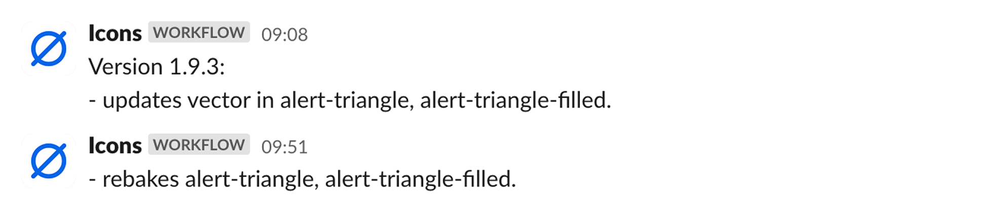
Figma updates triggered a Slack workflow so teams saw when components or tokens changed.




Figma deprecation
I defined a deprecation process with migration steps and staged releases.
Old components are removed in a planned way with clear instructions on how to update them. Every change goes through a formal request and peer-review process. Releases are done in stages through automated pipelines, and the documentation is updated each time, giving clear guidance for future changes.
Process description
- fully remove a Figma component from the lib without any replacement.
- deprecate and then remove a Figma component from the lib providing a replacement.
Procedure
- Duplicate original component
- duplicated component after applying all necessary changes must be published providing release notes
- original component must be renamed
- description field of the Figma component should be filled up with instructions (see template below)
- Rename
- ⚠ use a warning sign in the title: ⚠ Button
- add Banner with a message in order to keep visual separation from other components on the page
- Provide timelines
- by default any deprecated component in Figma can be removed in 2-3 months
- Tips
- Deprecating/removing library components will not change existing design layouts
- Restore Component button can be used in order to restore missing or removed components
- Communication link must be provided
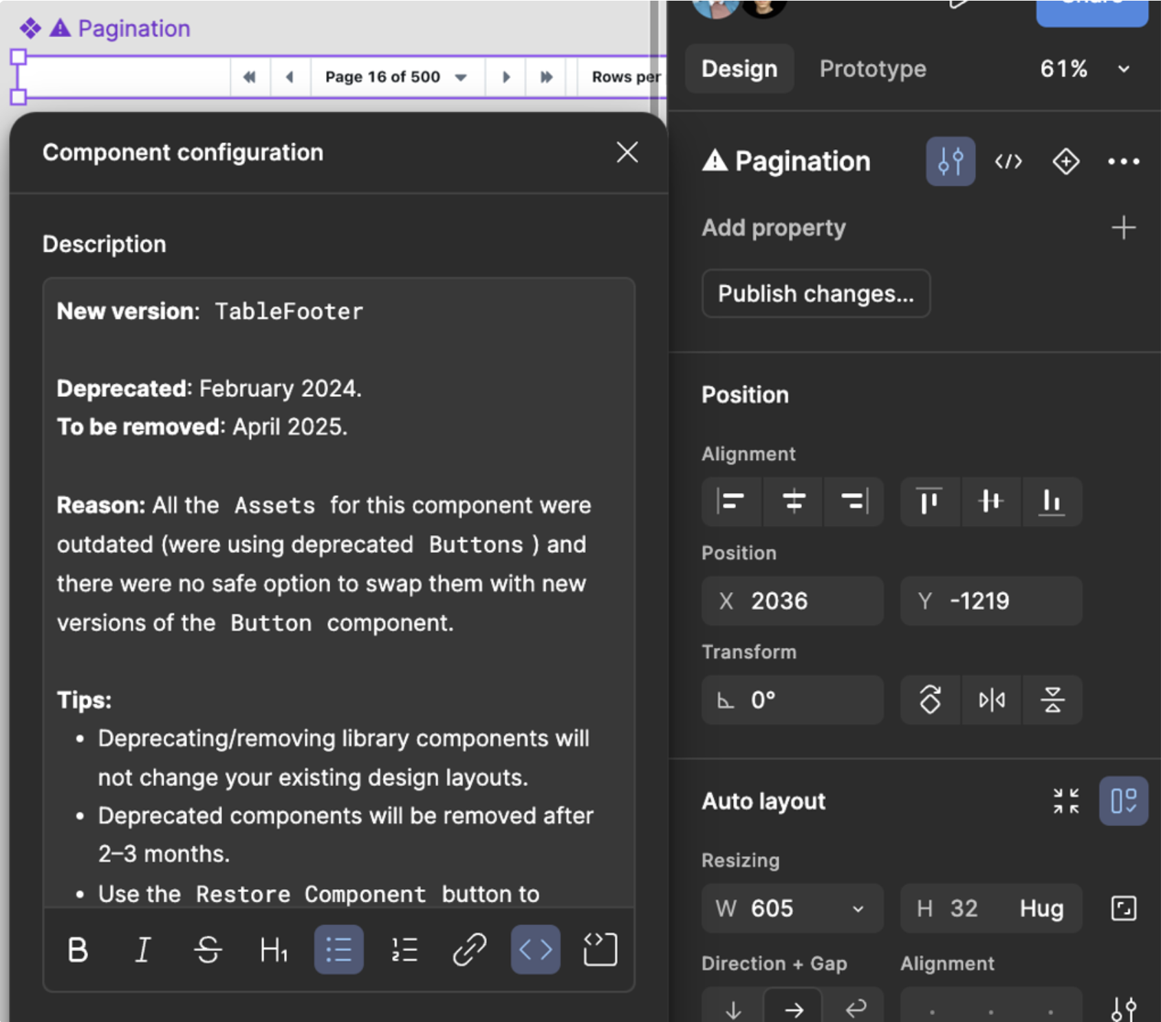
Message template
Description
- New version: Component Name (e.g. TableFooter)
- Deprecated: MMMM YYYY (e.g. February 2024)
- To be removed: MMMM YYYY (e.g. April 2025)
- Reason: Describe reasons in 1-2 sentences, stay specific (e.g. Refactoring of the [prop name] was causing breaking changes)
Tips
- Deprecating/removing library components will not change your existing design layouts.
- Deprecated components will be removed after 2-3 months.
- Use the Restore Component button to restore missing or removed components, however consider switching to a new version first.
- Need help? Reach us in #design.
Components
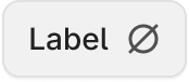
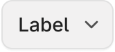
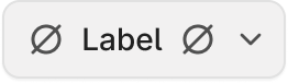
_Button-wireframe
 |
 |
 |
 |
 |
Button-primary
| rest |  |
 |
 |
 |
 |
| hover |  |
 |
 |
 |
 |
| pressed |  |
 |
 |
 |
 |
| focus |  |
 |
 |
 |
 |
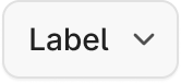
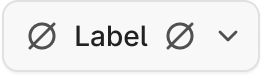
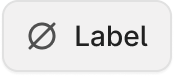
Button-secondary
| rest |  |
 |
 |
 |
 |
| hover |  |
 |
 |
 |
 |
| pressed | 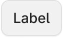 |
 |
 |
 |
 |
| focus | 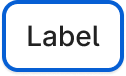 |
 |
 |
 |
 |
Button-primary-invisible
| rest |  |
 |
 |
 |
 |
| hover |  |
 |
 |
 |
 |
| pressed |  |
 |
 |
 |
 |
| focus |  |
 |
 |
 |
 |
Button-secondary-invisible
| rest |  |
 |
 |
 |
 |
| hover |  |
 |
 |
 |
 |
| pressed |  |
 |
 |
 |
 |
| focus |  |
 |
 |
 |
 |
Button-positive
| rest |  |
 |
 |
 |
 |
| hover |  |
 |
 |
 |
 |
| pressed |  |
 |
 |
 |
 |
| focus |  |
 |
 |
 |
 |
Button-negative
| rest |  |
 |
 |
 |
 |
| hover |  |
 |
 |
 |
 |
| pressed |  |
 |
 |
 |
 |
| focus |  |
 |
 |
 |
 |
Button-disabled
 |
 |
 |
 |
 |
Component layer structure
content
  └ content-wrapper
    ├ leading-icon
    ├ Label
    └ trailing-icon
  └ trailing-action
ButtonIcon
| primary | secondary | primary-invisible | secondary-invisible | |
|---|---|---|---|---|
| rest |  |
 |
 |
 |
| hover |  |
 |
 |
 |
| pressed |  |
 |
 |
 |
| focus |  |
 |
 |
 |
RadioInput
| rest |  |
 |
| focus |  |
 |
| disabled |  |
 |
Component layer structure
dot
focus-outline
radio
Radio
| rest |  |
 |
| focus |  |
 |
| disabled |  |
 |
Component layer structure
radio-wrapper
    └ RadioInput
label-wrapper
    ├ Label
    └ Caption
Proof: Riyadh Air
In 2024, FLYR had to show it was a full retail platform and not only a pricing engine. Riyadh Air wanted a booking experience that could go head to head with the best airline sites: cart, order management, seat selection, ancillaries, and payment. It had to run on a modular architecture we could reuse for other airlines, and it had to land fast enough to back a partnership announcement and a $295M funding round.
Without a shared UI foundation, a build like this runs 18 months or more. We had 12. We shipped in 6. Every booking pattern (Shopping Cart, Product Catalog, Ancillary Selector, Order Search) came straight out of existing Orville components. We didn't build a single new primitive; it was all composition.
My role
I led a small cross-functional team, a designer and two front-end engineers. We kept feature priorities tied to the pilot's business goals, held the patterns consistent across flows, and leaned on Orville instead of spinning up a client-specific mini design system.
Outcome
- Full search → seat selection → cart → payment booking flow.
- A strategic partnership with Riyadh Air, positioned publicly as a digital-first airline.
- A $295M funding round where the digital experience helped tell FLYR's platform story.
Impact
Rolling out the system
We treated adoption as a product launch:
- Regular enablement sessions and workshops with product teams.
- Slack-based support and “office hours” for design-system questions.
- Usage tracking across the React codebase and Figma libraries.
Core components React library adoption
Building it wasn't enough on its own. We ran workshops, answered questions in Slack, and tracked how components were actually used.
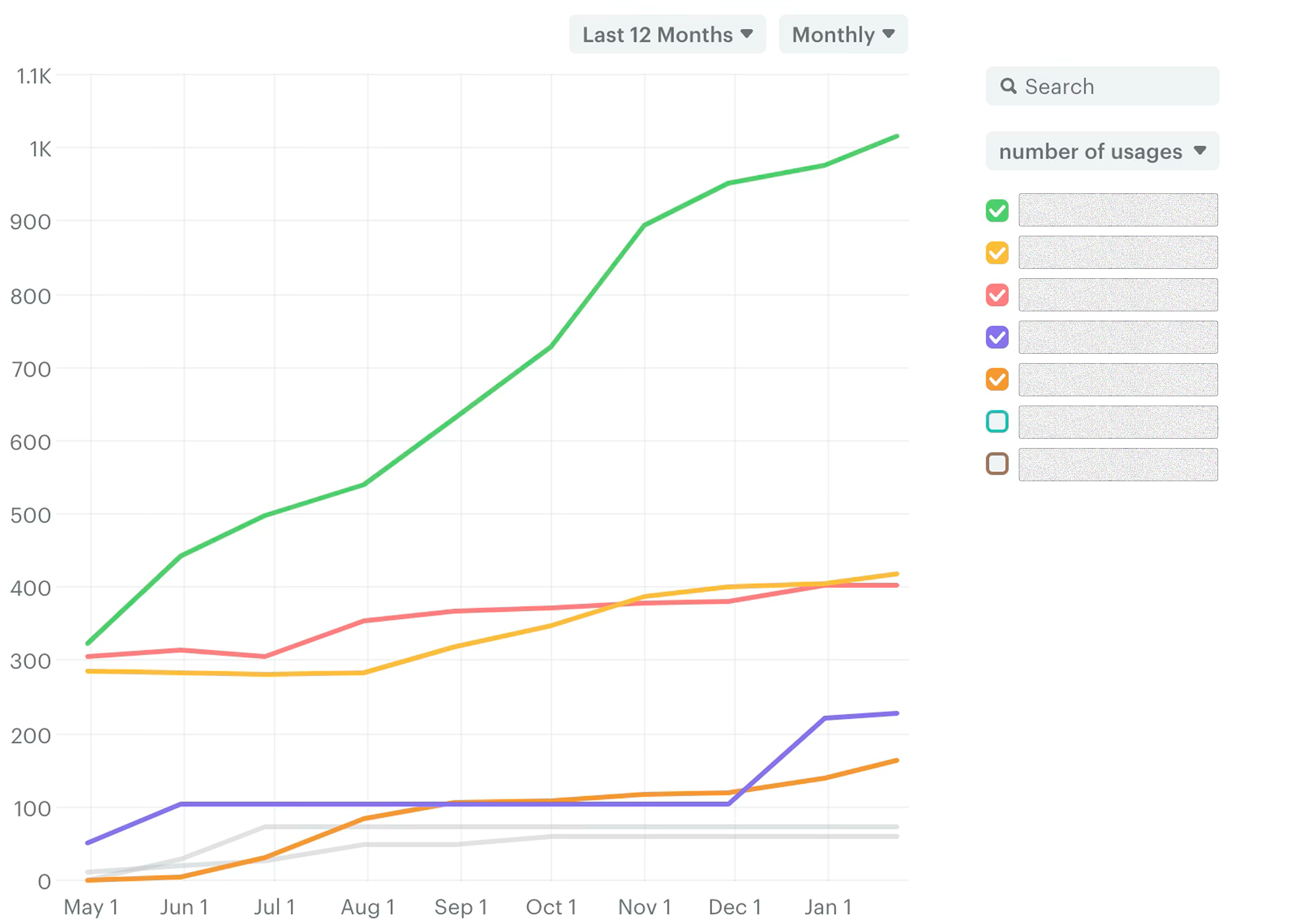
- 100%
- Total code components
- ~2k
- React component usage gains
Figma libraries adoption
Figma adoption grew through targeted workshops and learning sessions. Components are the main piece designers shape through the contribution process, and the documentation keeps it all connected and easy to find.
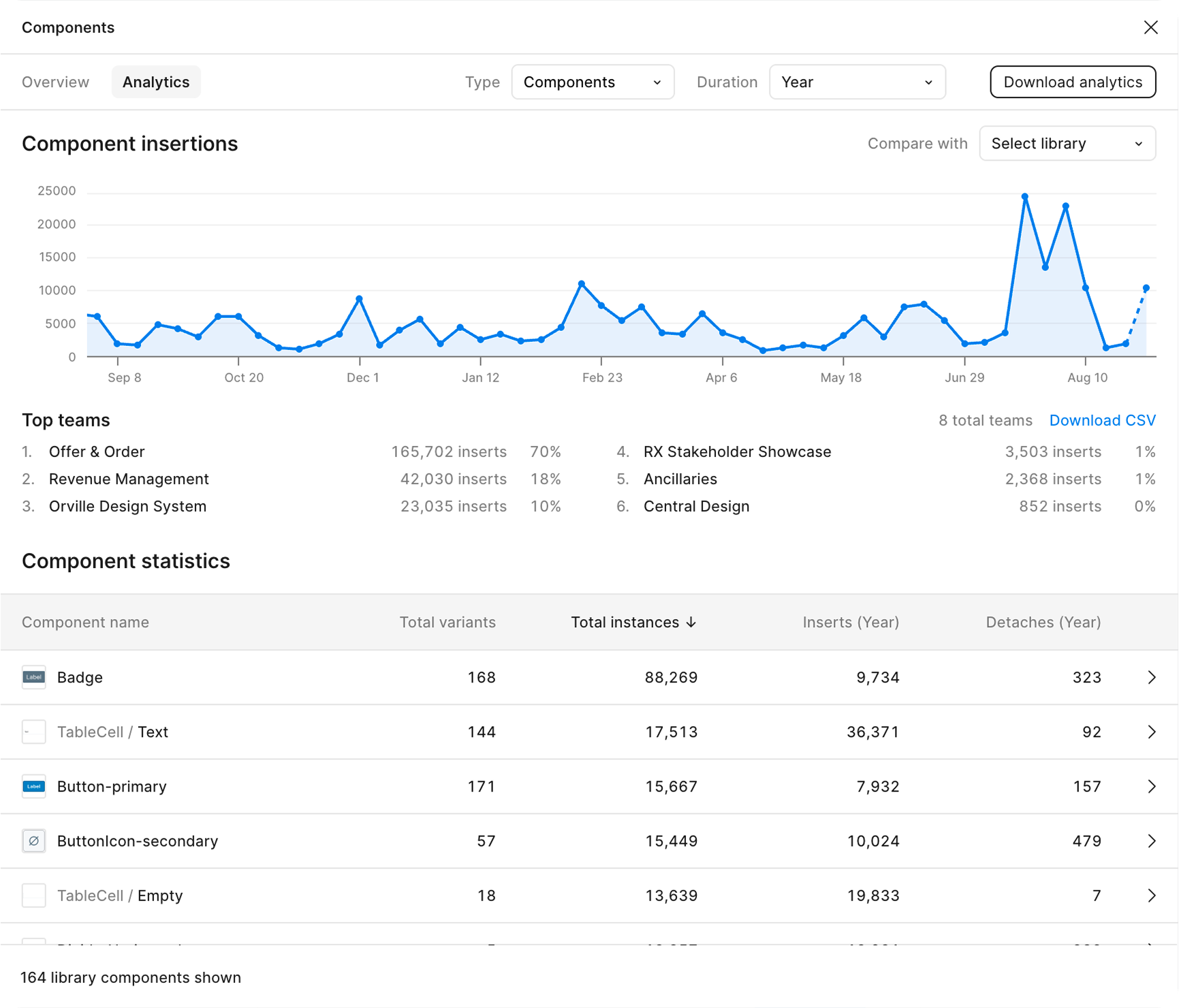
- 13
- Used by teams
- 96.6%
- Figma components inserts
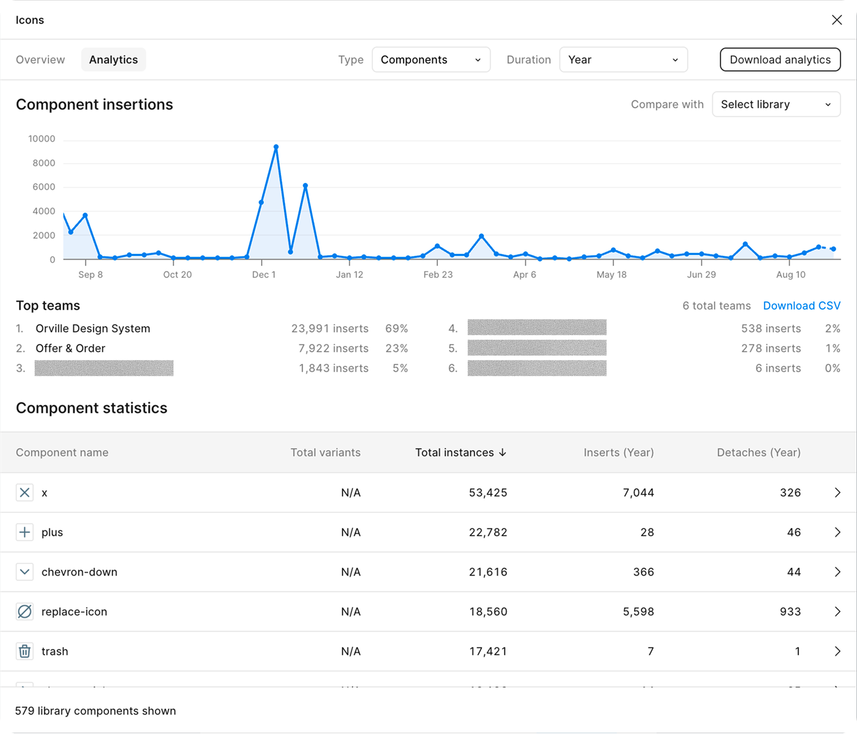
Icons and Styles stats
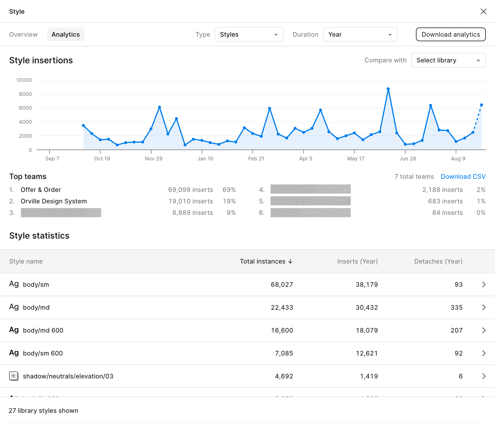
What changed
- Teams stopped building bespoke UI and started composing flows from existing Orville components.
- New features shipped sooner, because reusable patterns replaced one-off UI.
- The product suite ended up with one visual language that holds up across new domains and customers.
By the numbers
The system earned its own budget and a second designer, and by July 2025 every new FLYR product was built on Orville. We survey designers and engineers twice a year. Here are the latest numbers:
- +1
- Designer hired
- $
- Budget allocated
- 95.5%
- Designer sentiment
- 87.5%
- Engineer sentiment
Lessons learned
- Start small. Twenty well-chosen components that solve real problems beat two hundred abstract ones.
- Get buy-in early. Leadership wants to see value fast: metrics, speed, and help closing key deals.
- Treat adoption as a product. It only works with enablement, support, and a clear process.
- Documentation beats perfection. A well-documented “good enough” component outperforms a perfect one nobody can use.
- Design systems drive deals. We weren't selling “50 components.” We were selling faster delivery and wins like Riyadh Air.
In press
Travel Startup Flyr Raises $295 Million in Equity and Debt.
We will be at the forefront of innovation when it comes to booking travel experiences.
Riyadh Air will be the world's first digitally native airline.
Together, Riyadh Air and FLYR are transforming the passenger experience with shopping cart capabilities for passengers at every touch point.
Offer & Order: Built Right. Designed to Deliver.