Context
The product existed as a fragmented MVP when work on Capacity & Promotions began (August 2021): disconnected screens, no unified mental model, and no design system. The product served Revenue Management Analysts at mid-to-large carriers – a domain-expert user base with deep Excel habits and very low tolerance for ambiguity in system outputs.
The design team consisted of 2 UX Designers supporting 4 Product Owners across 4 cross-functional squads (~20 engineers). We worked closely with Data Science and RM Strategy teams who owned the underlying pricing algorithms, as well as directly with client RM teams at Air New Zealand and other airlines to validate requirements and run usability sessions.
Overview
- Replaced spreadsheet-driven workflows with a flight-centric B2B web app.
- Reduced daily capacity reconciliation from 4+ hours to ~2 hours per analyst (+50% productivity).
- Cut overbooking variance by 83%, reducing regulatory risk and empty seats.
- Accelerated promo launch from 8 hours to 90 minutes and eliminated post-launch corrections.
- Tripled filter complexity while reducing setup time from ~10 to 1 minute.
Object-oriented, not feature-oriented
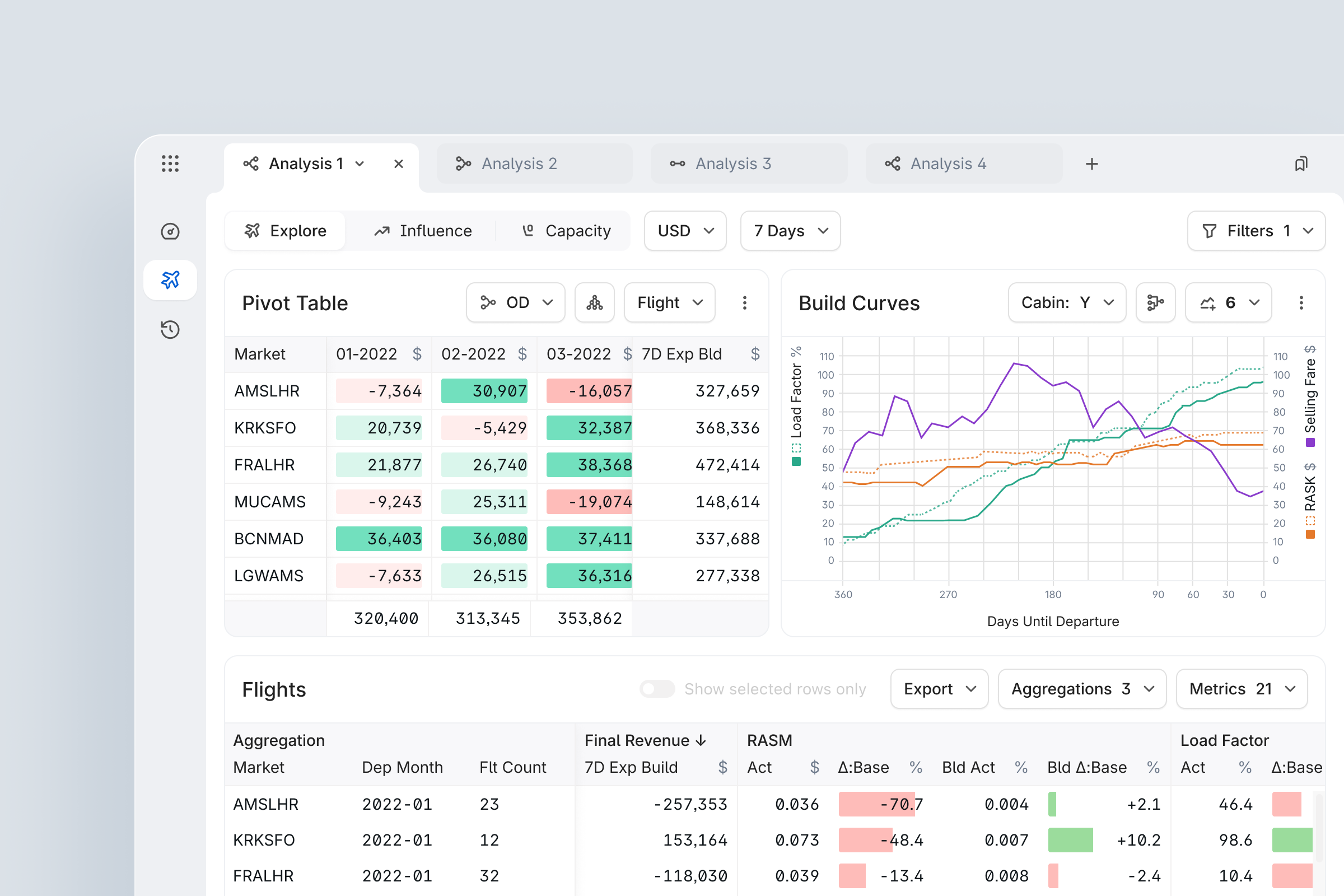
Instead of designing separate “apps” for Capacity, Pricing, and Promotions, I applied an Object-Oriented UI approach and treated Flight as the central object that all analysis modes operate on.
This created a single mental model: analysts are always working with flights, just in different contexts (Capacity, Influence, Promotions, etc.), so the system feels like one tool instead of stitched-together modules.
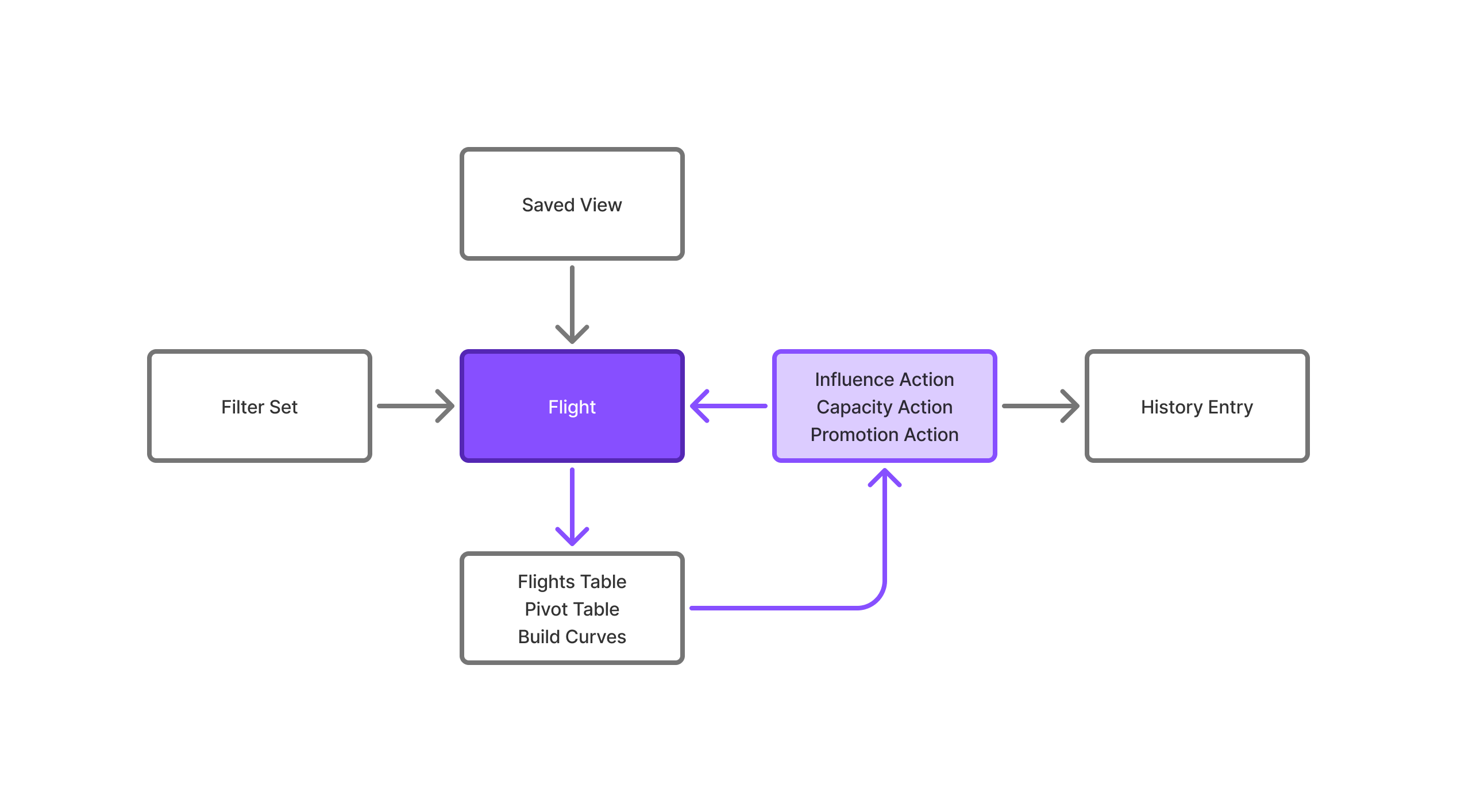
I mapped a system-wide Object Map where Explore, Influence, Capacity, and Promotion all share the same core objects and attributes, with different views and actions layered on top.
Constraints & Starting Hypotheses
Key constraints
- No direct access to airline PSS – all capacity data arrived through Products's integration layer with a lag
- Products's capacity adjustments are one-time, non-persistent: unlike Influences (which re-apply daily), overbooking adjustments are applied immediately and overwritten the next day by airline raw data – this fundamentally shaped the confirmation UX
- Analysts could not lose their existing Excel audit trail during transition – trust was a hard constraint, not a nice-to-have
- Per-airline, per-cabin feature toggles required: not all airlines opted in to overbooking capability (admin config)
- Two parallel squads shipping simultaneously: design specs needed zero ambiguity at component level
Initial hypotheses
- H1
- Analysts distrust the system because calculation results are invisible – showing a real-time preview before confirming will increase adoption
- H2
- The drill-down table pattern traps users in hierarchies – a flat Filter + Aggregate model will reduce cognitive load and enable more complex analyses faster
Both hypotheses were validated through moderated usability sessions with Revenue Analysts at Air New Zealand.
Design Process
Each of the 6 feature modules (Explore, Influence, Capacity, Promotions, Filters, History) ran a compressed double-diamond over 3-4 month cycles.
Discover & Define
- Stakeholder interviews with Revenue Analysts, RM Directors, and Data Science leads
- 1-week shadowing sessions (Capacity module: 5 analysts, 2 airlines)
- Client feature prioritization workshops with quantified impact scoring (High/Medium/Low × client-rated priority × engineering effort)
- Competitive landscape review: Sabre AirVision, IDeaS, Navitaire
Develop & Deliver
- Lo-fi wireframes → PO alignment → hi-fi using Orville Design System
- 2-4 design iterations per module; validated via moderated usability sessions or async review with analyst champions at Air New Zealand and others
- Joint QA + design review with FE lead post-build
- Phased rollout: 1 pilot airline → 3 → 5
Cross-team collaboration
Synced weekly with 4 POs across separate squad rituals. Bi-weekly cross-squad alignment kept shared components consistent. Design decisions that blocked engineering were escalated with written rationale — feature backlog was maintained with JIRA tickets and tracked against quarterly roadmap.
Design principles
These principles guided the architecture and interaction patterns:
- Flight-centric model
- All features operate on the Flight object
- Analysts switch context, not tools
- No hidden state
- Every impactful action shows a preview before commitment
- 'Apply' control only appears after calculation succeeds
- One pattern, many places
- Filter → Aggregate → Update pattern used in Capacity, OD, Promotions
- Once learned, works everywhere
- Audit by default
- Every decision writes History entry with ID
- No silent changes
Capacity & Overbooking
Problem
Airlines were losing money on almost every flight - not because they priced badly, but because nobody had a reliable view of how many seats they could really sell.
- Conflicting capacity systems
- Physical (aircraft)
- Restricted (regulation)
- Virtual (sellable inventory)
- 4+ hours daily
- Revenue analysts reconciling in Excel
- High variance
- 115% target capacity resulted in 108-121% actual
- Quarterly losses
- Regulatory fines
- Empty seats
- Missed revenue
Goal
- Real-time visibility
- Trustworthy capacity data across all systems
- Predictable overbooking
- Actual results match targets (±5% or better)
- Zero manual work
- Eliminate daily Excel reconciliation
What I designed
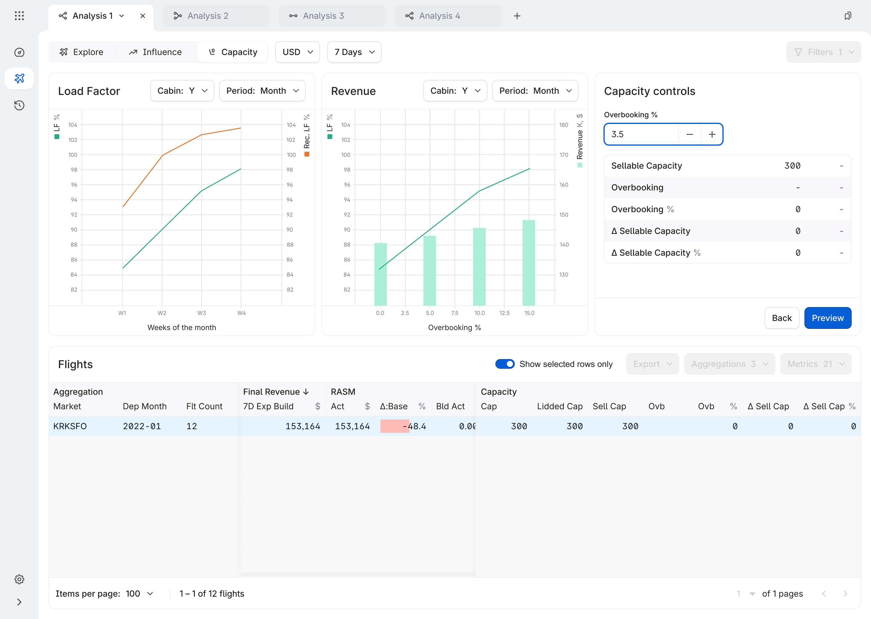
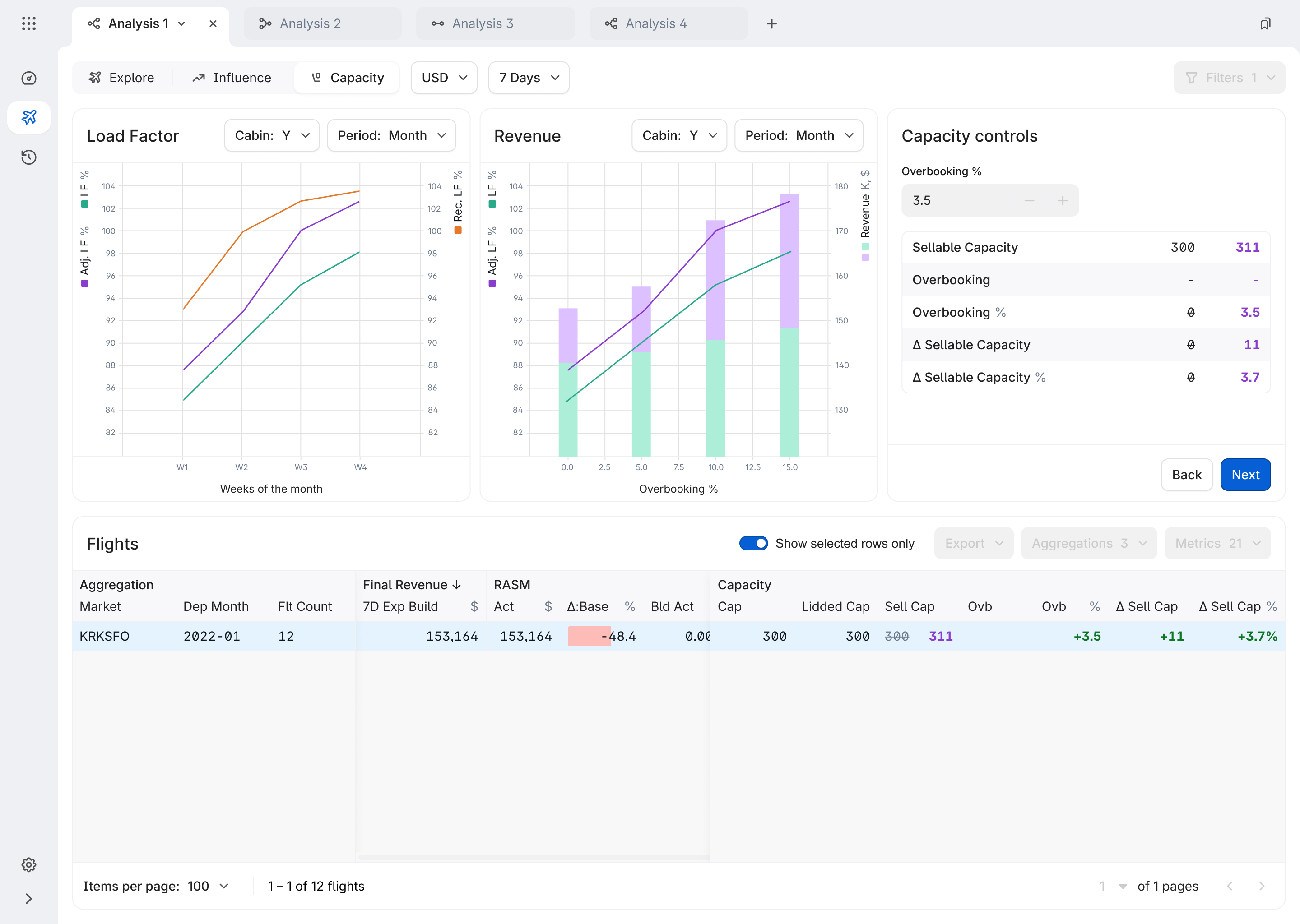
6-step wizard with real-time preview
The overbooking wizard was designed around a critical system constraint: capacity adjustments are one-time events – unlike Influences, they are not re-applied on daily model runs. Once an analyst acts, Product becomes the source of truth for overbooking on that flight until departure.
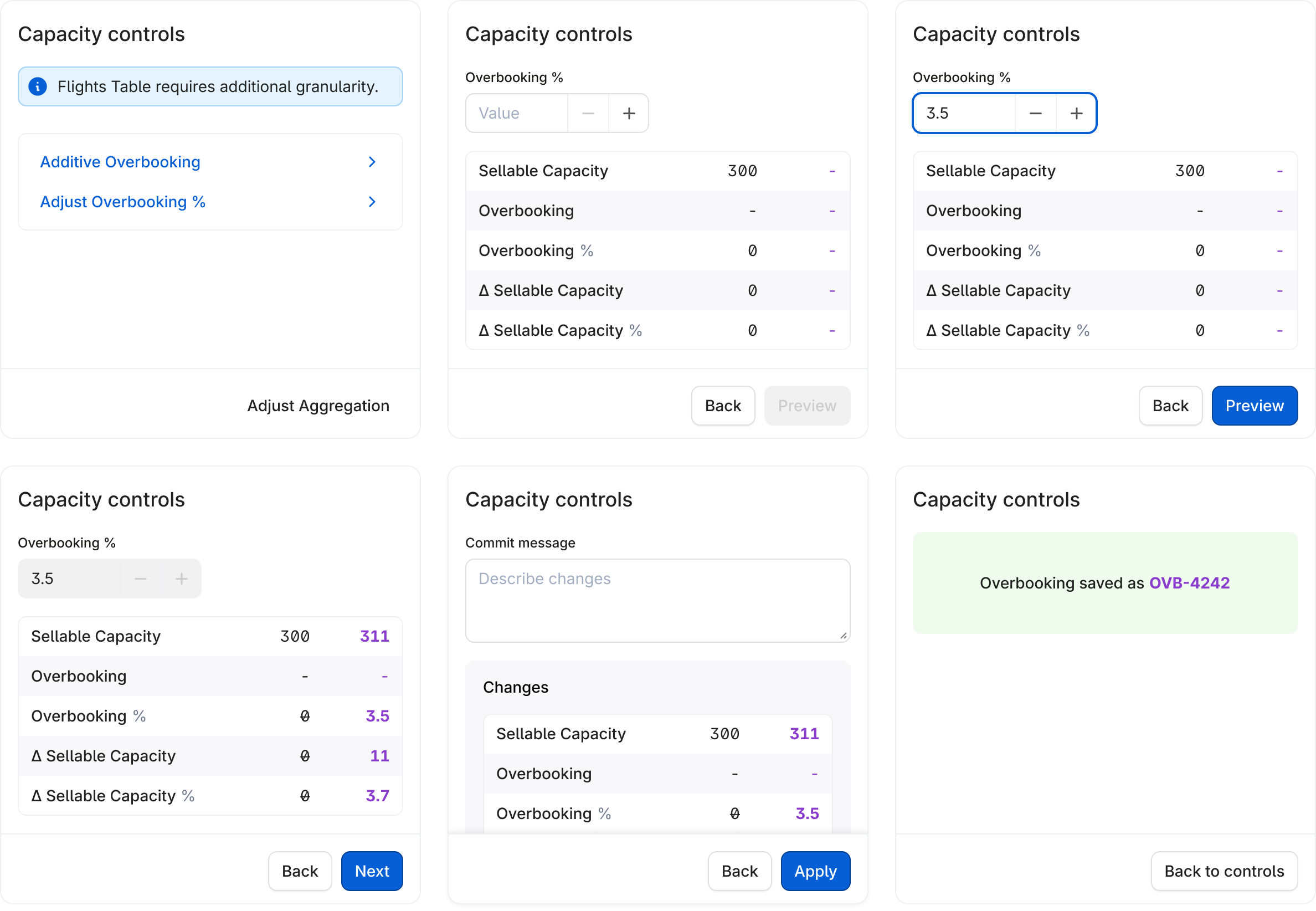
-
1. Filter by single cabin
Single cabin required – Y or W, not mixed Y -
2. Select rows at any aggregation level to adjust
Single flight, market, or full network KRKSFO -
3. Enter overbooking value
Must be ≥ 0, max 1 decimal point 3.5% -
4. Preview impact in real-time
result rounded by standard rules (2.5 → 3 seats, 4.15 → 4 seats) +11 seats/flight -
5. Add a comment
Audit requirement -
6. Confirm & log to History
Analyst name, markets, cabin, flight count, min/max departure dates OVB-4242
Now this flight sells 300 seats. At 3.5% overbooking → 311 seats (+11). After confirmation, Product automatically recalculates and resends Bid Price and some files to the airline's downstream systems.
Research insight
I shadowed 5 analysts for a week. Key finding: they didn't trust the system. They'd set targets, then manually verify 10-15 flights in another tool because results rarely matched. The problem wasn't the algorithm – it was invisible results.
Making the invisible visible
By showing the impact of every change before it happens, analysts could trust the system and stop manual verification.
Results
- 83%
- Variance reduction
- $1M+
- Revenue recovered
- +50%
- Analyst productivity
- 75%
- Empty seat loss
* Q1 2022-present, 5 airlines
Filters
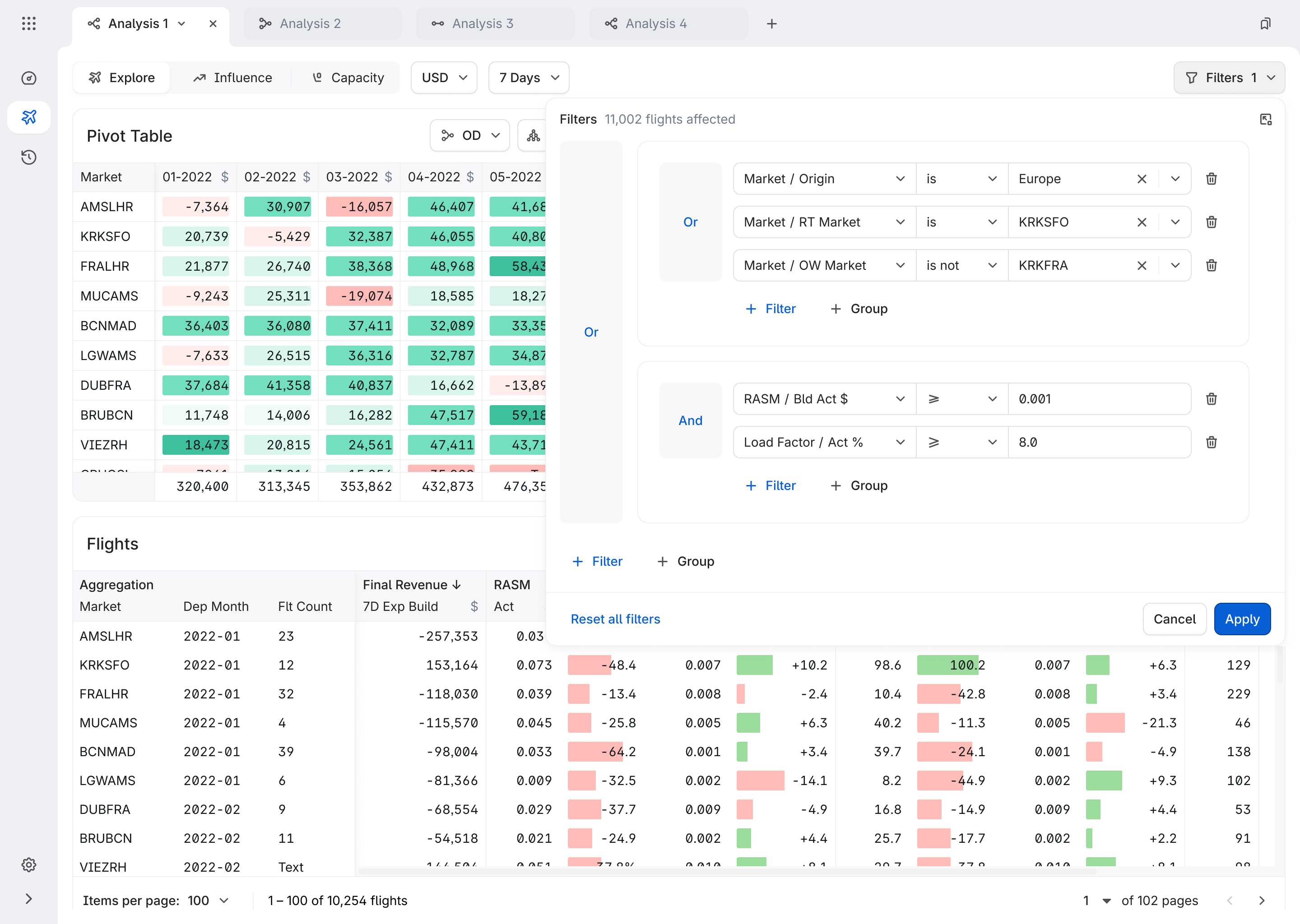
The filter & aggregation pattern
After multiple design iterations, we killed the drill-down inside the Flight Table idea. The feature was explicitly requested ("High" priority, client-rated), but testing revealed a deeper problem: drill-down forced analysts into nested hierarchies where changing context meant starting over.
Instead, we built a flat Filter + Aggregate model where the table updates in-place at any aggregation level – Region, City-pair, or Flight – without losing the current filter state.
This also resolved a real usability complaint: analysts were losing their filter configurations when navigating between views, prompting requests for undo/go-back commands. The flat model eliminated the need for undo entirely.
- Aggregation level
- Region
- City-pair
- Flight
- Filter slices by
- Date
- Competitor count
- Profitability
- Table updates in-place
- No navigation
- No lost context
- Consistency
- Same mental model across products
What I designed
Results
The new filter system transformed analyst workflow from a frustrating bottleneck into a fluid, keyboard-first experience. Teams now create 3× more complex analyses in 80% less time, with saved filter sets becoming institutional knowledge shared across departments.
- 1 min
- Filter setup time
- 5 min
- Average decision making time
- 3×
- Query complexity
* All since Q1 2022, across 5 airlines.
In press
FLYR's platform filters detailed information instantly through the Cirrus dashboard and user interface, enabling airlines to conduct greater analyses and generate reports for informed decision-making.
Challenges & Learnings
Biggest challenge is building trust with a skeptical user base.
Analysts had been burned by previous tool migrations and doubted whether the system's capacity numbers could be trusted. There was no calculation preview — analysts would enter an overbooking value and confirm blind. We added a dedicated preview step showing the exact impact before commitment: seat delta per flight, flights affected. That transparency moved adoption from hesitant to confident in one sprint.
The hardest constraint is designing around a 24-hour data lag.
Product received capacity data from airlines via Inventory Schedule (a Sabre snapshot generated at 11 PM, available at 6 AM). This meant any overbooking adjustment an analyst made at noon could only be confirmed in the system the next morning. We couldn't fix the data pipeline — so we designed around it: the confirmation screen explicitly states that external capacity changes (made in airline systems outside Product) won't be reflected until the following day. Transparency as a feature.
What I'd do differently
Invest earlier in a shared component library with engineering. For the first 6 months, color, typography, spacing and state-handling misalignment caused rework. That experience directly motivated the Orville Design System initiative.
What I learned
In high-stakes B2B domains, system transparency is a UX feature. "Show your work" — surfacing the formula, the audit ID, the exact flights impacted — is as important as "make it simple."