Business chalange
The client's company was scaling fast. By 2020, they managed 20,000+ trucks across 10+ African countries, working with clients like Cargill, DHL, and Honeywell Flour Mills. They had internal tools – a dispatcher terminal and driver app – but cargo owners saw nothing.
The Problem
Cargo owners lacked tracking and status updates, so they couldn’t verify their goods were handled properly: deliveries often took too long, customers reported damaged goods.
The Goal
Real-time visibility. Proof of careful handling. A client app that felt modern, trustworthy, and actually African.
Understanding the User
The client conducted field research in Kenya with cargo owners (large and small firms) and freight companies. I worked with the collected data to structure the research findings and define design priorities.
What the data showed
Pain points
- 74%
- reported long delivery times as the main issue
- 70%
- experienced damaged cargo regularly
- 64%
- wanted better tools to build new business relationships
- 43%
- needed more client-oriented communication
Market position
- By 2019, African logistics had apps for drivers and web portals for enterprise shippers – but cargo owners still used WhatsApp to ask "Where's my delivery?"
Competitive landscape
| Kobo360 | OnePort 365 | Finch | |
|---|---|---|---|
| Primary user | Truck drivers | Importers/exporters | Cargo owners |
| Platform | Driver app | Web portal | Client Android app |
| Focus | Driver marketplace | International freight | Cargo visibility |
| Key feature | Fleet optimization | Customs brokerage | Condition photo reports |
User expectations
- 84%
- Get goods intact
- 62%
- Deliver and receive cargo on time
- 59%
- View cargo progress and status updates
- 35%
- View route locations on map
Platform constraints
- 88%
- Android OS
- 3.6%
- iOS
- Low-end devices, $50-80 price range
- Unreliable networks
The trust gap
- Cargo owners could track a $3 Uber ride but not their $5,000 shipment. They wanted proof their goods were safe.
User needs
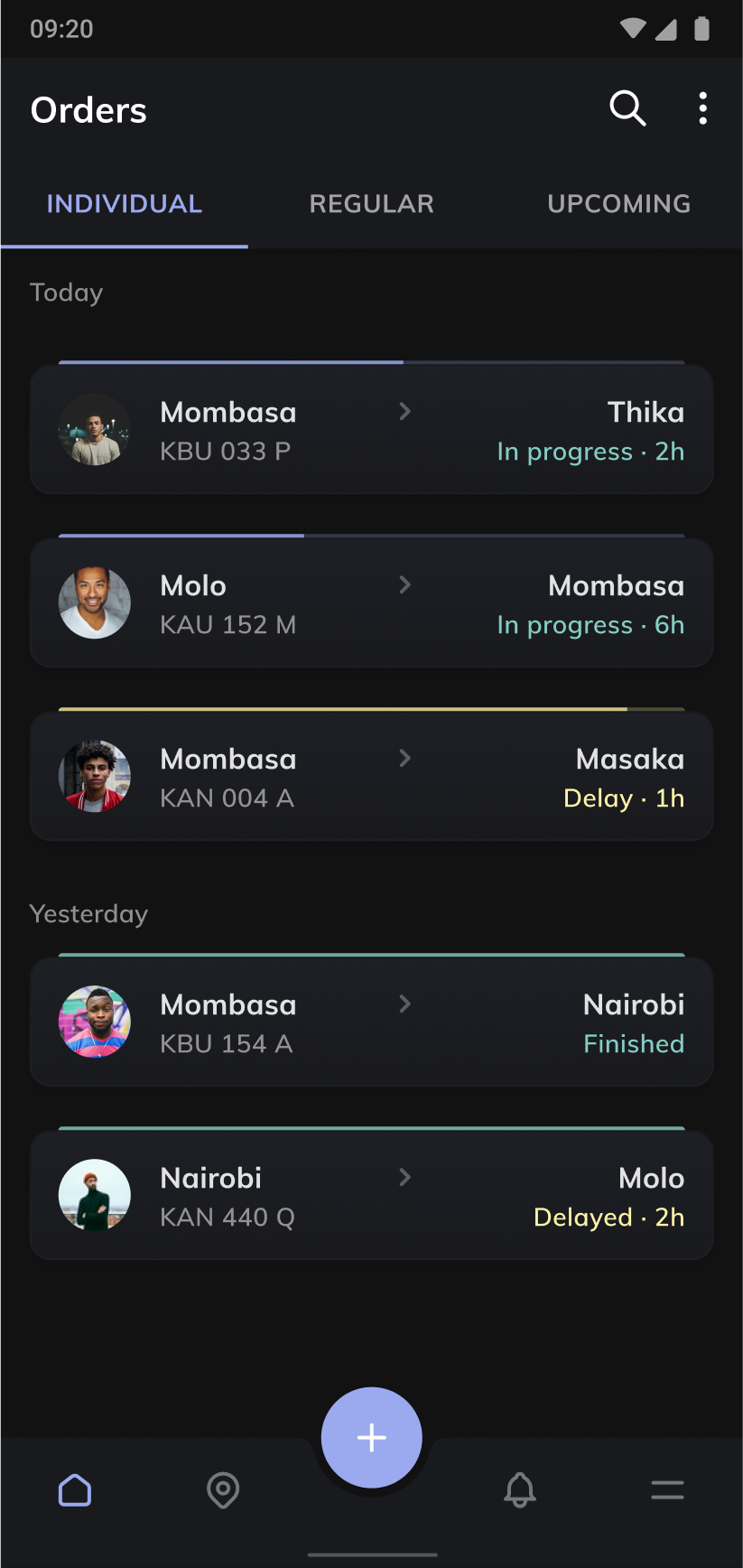
- Real-time tracking
- Cargo owners needed proof their shipment was moving, not promises
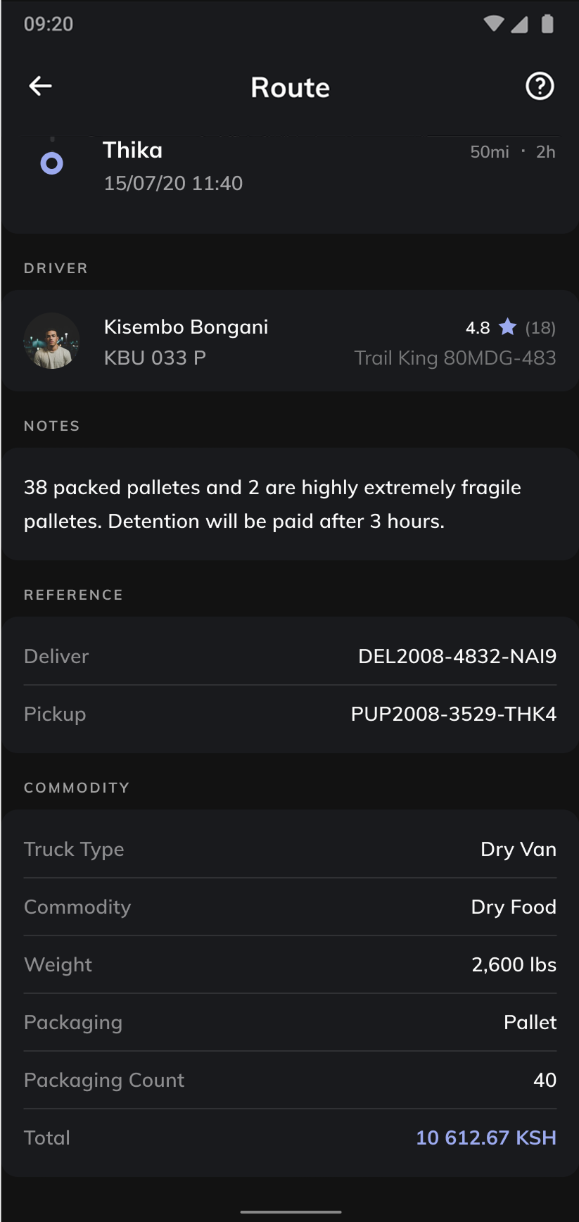
- Condition reporting
- Photo uploads as evidence of proper handling
- Searchable order history
- Business owners managing multiple shipments needed quick access
- Work on $50 phones
- 88% of users had cheap Android devices with unreliable connectivity.
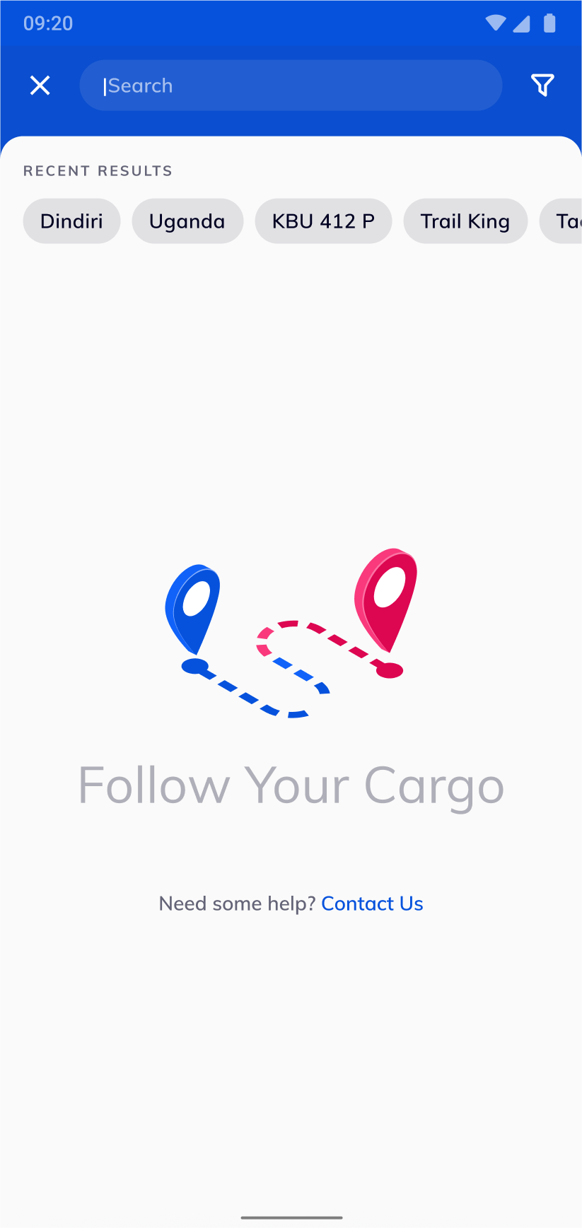
Mind Map
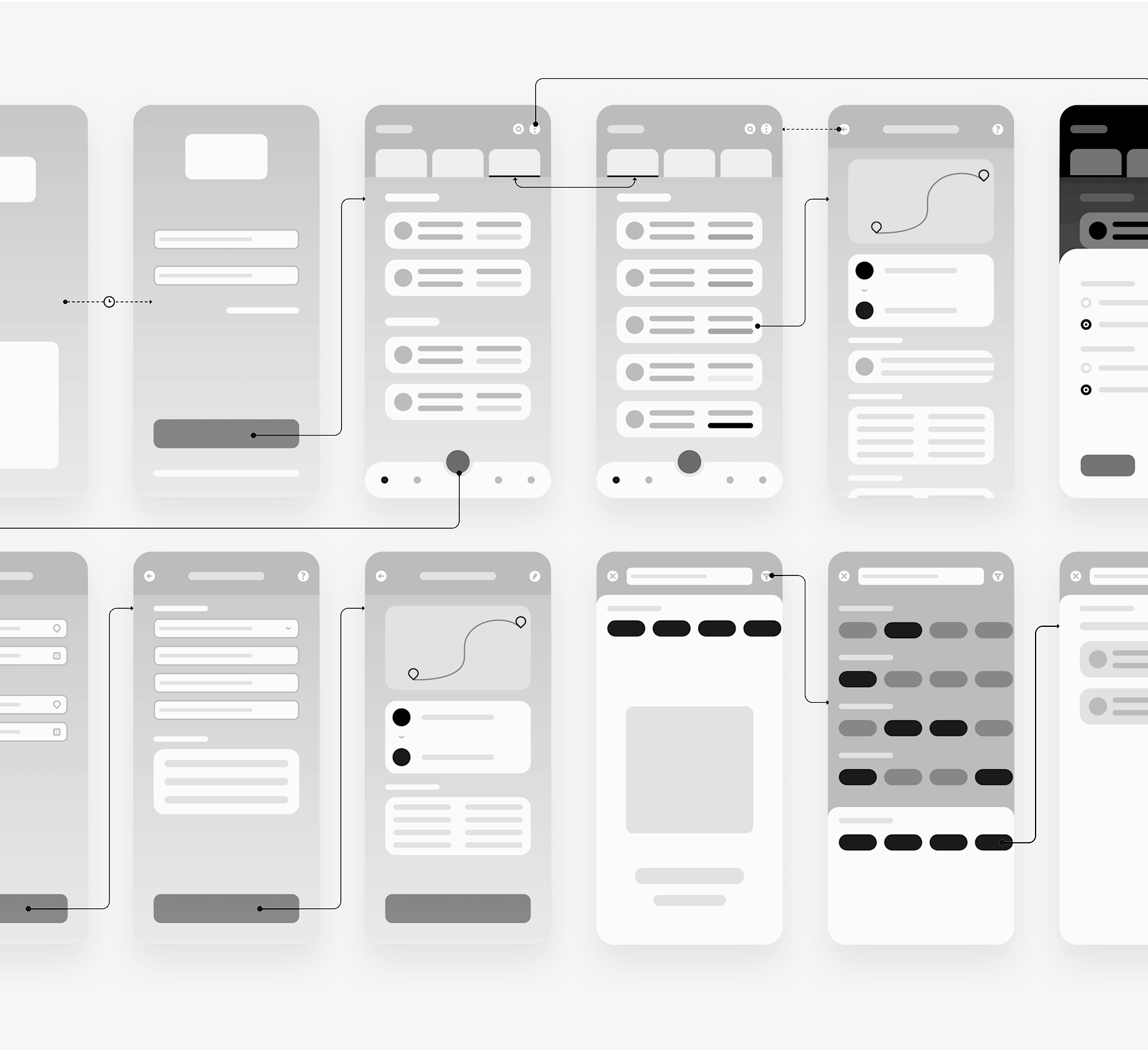
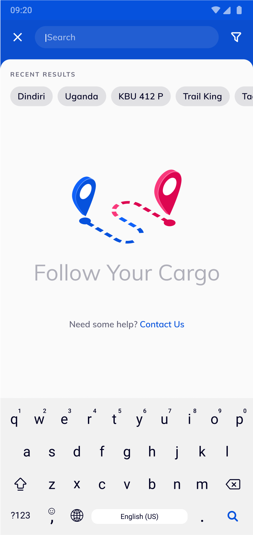
Wireframes
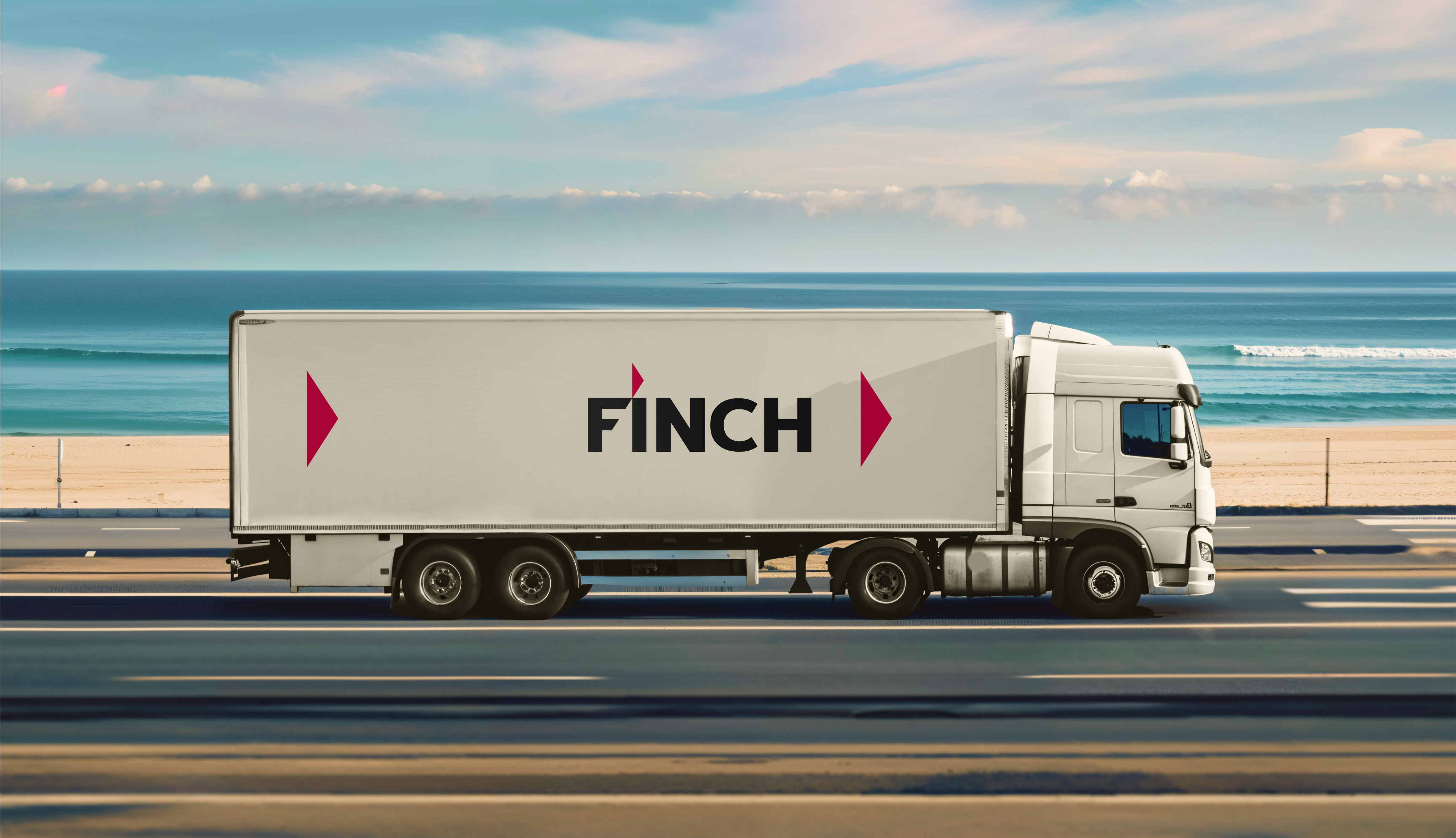
Logo
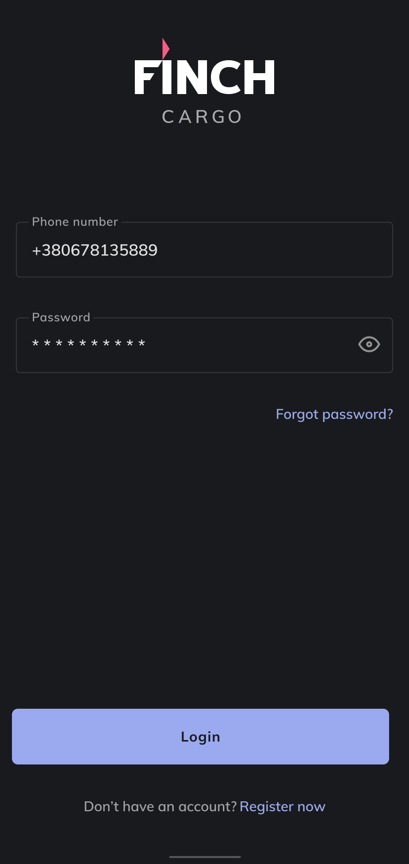
I refreshed the corporate logotype. We kept the Mulish typeface but tightened the letterforms into a cleaner, more geometric shape and added a stylized African‑finch motif to the dot of the “i”. The new color palette stayed within Material's color system but introduced warm, multitone gradients that evoke an African sunrise, giving the brand a lively yet professional feel.
Colors
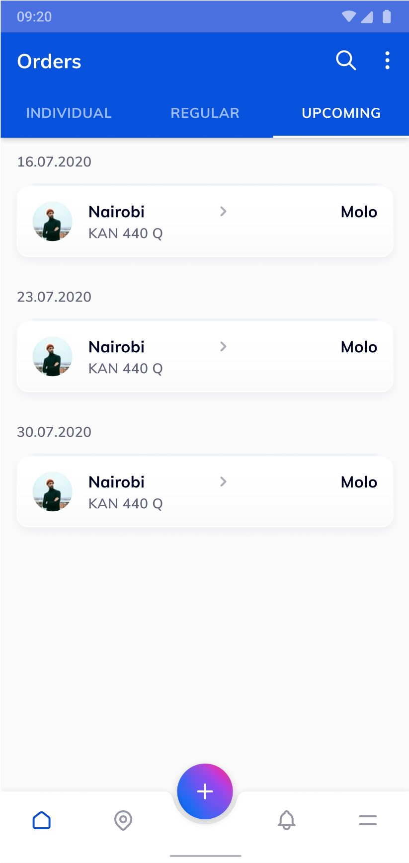
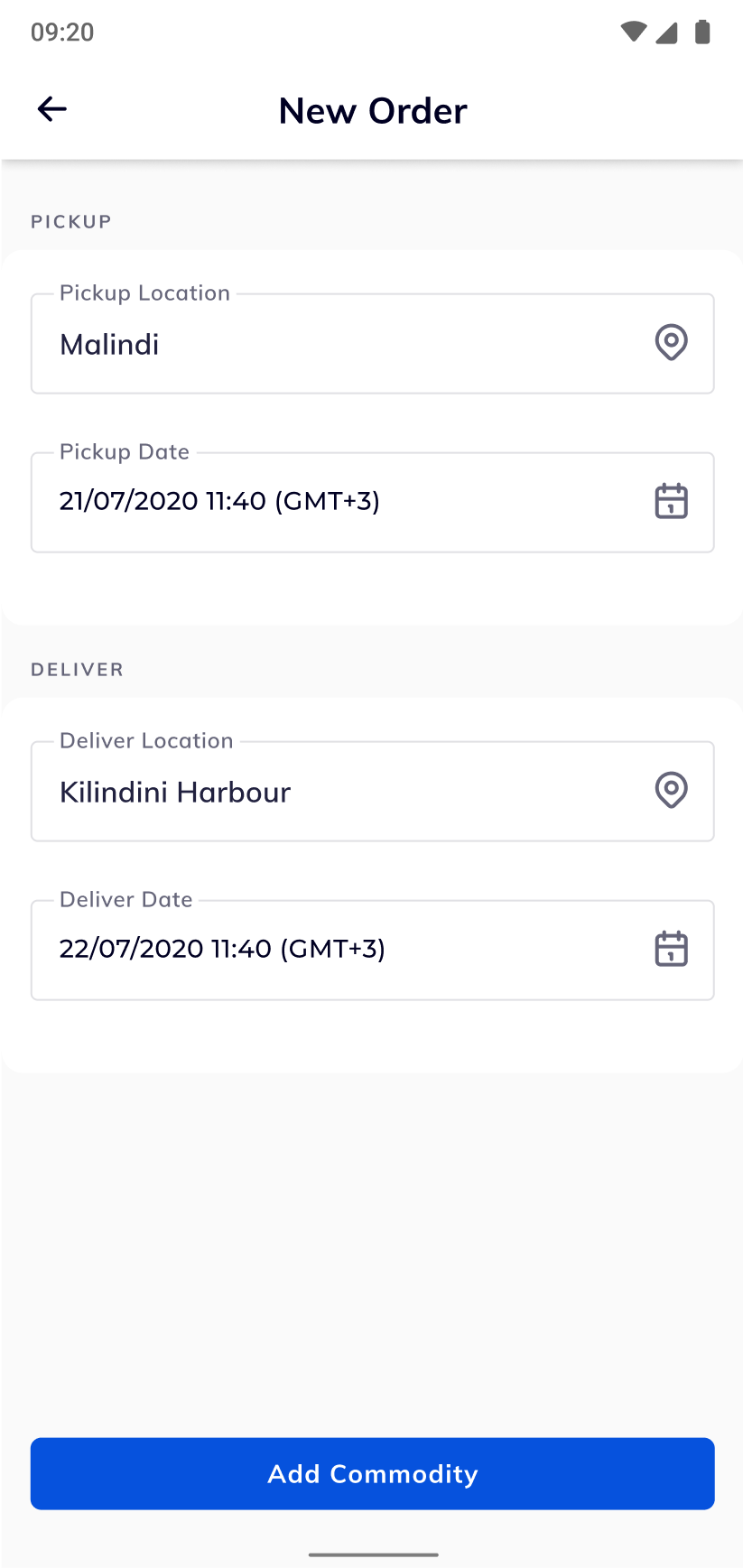
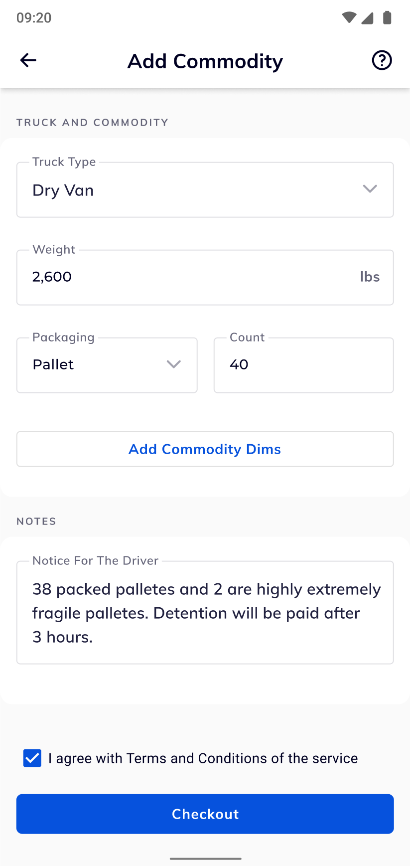
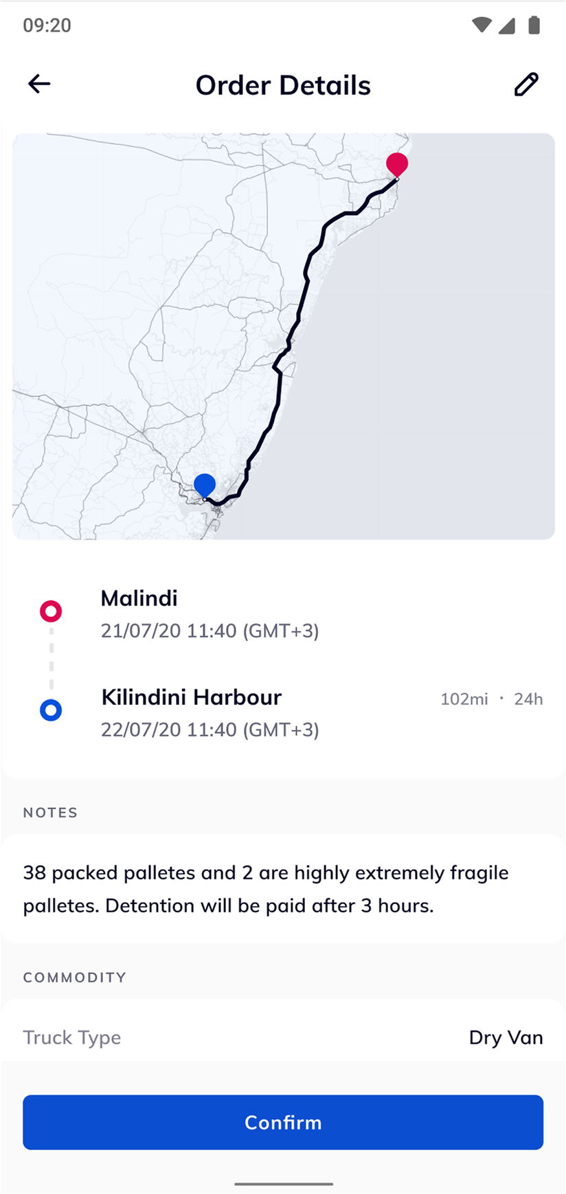
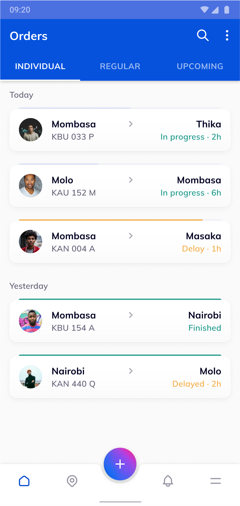
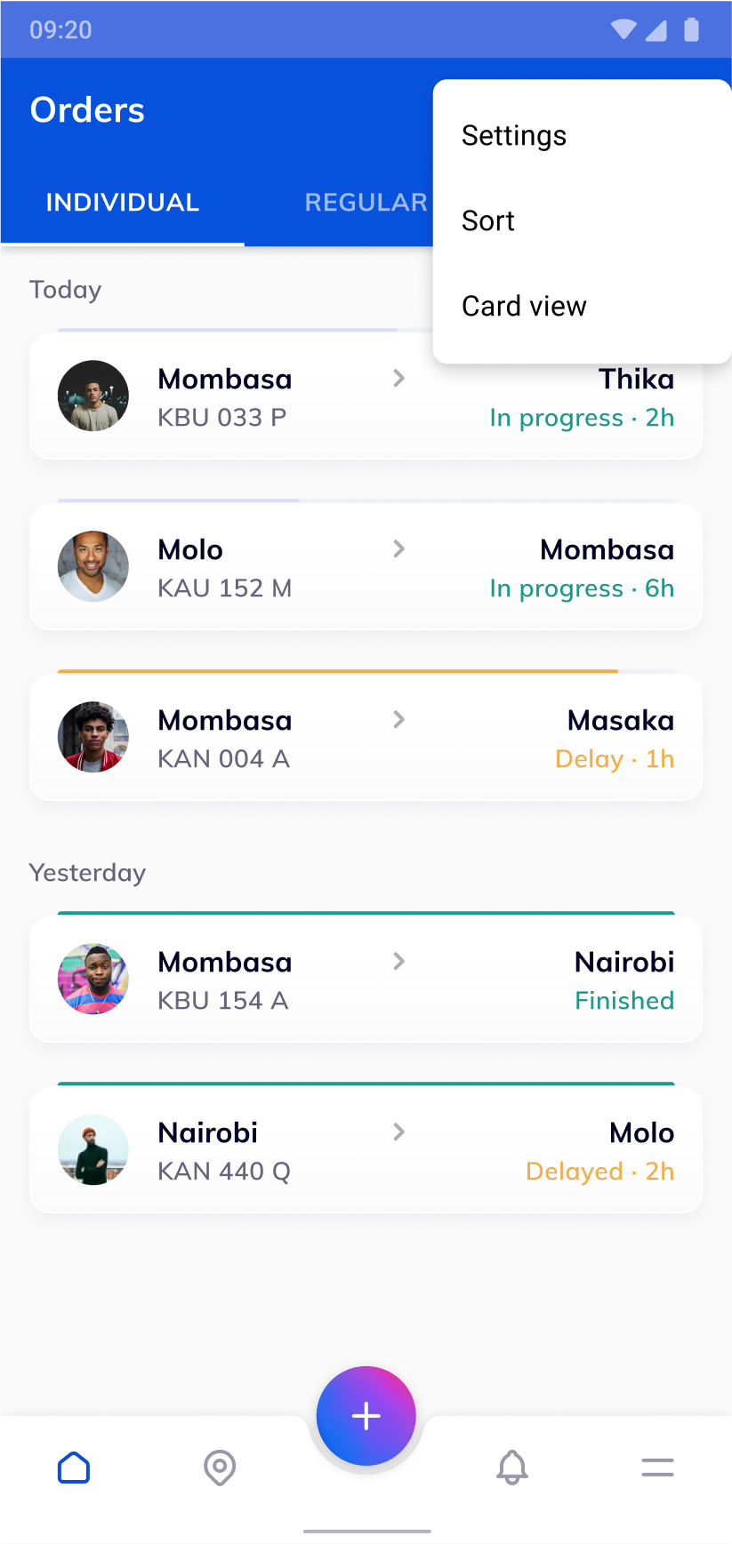
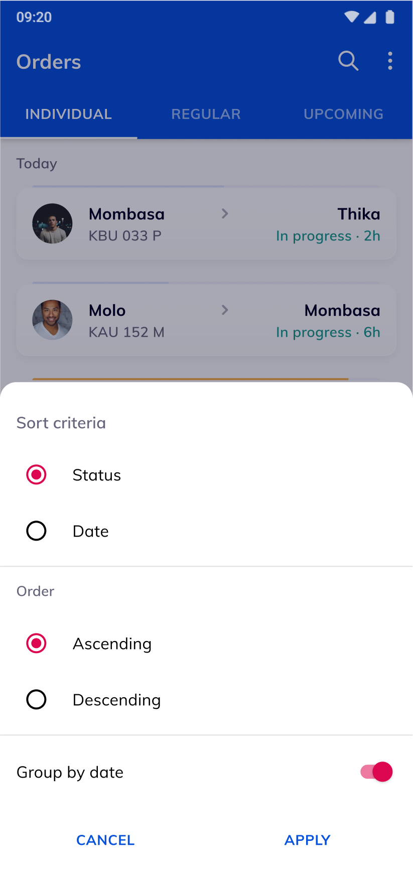
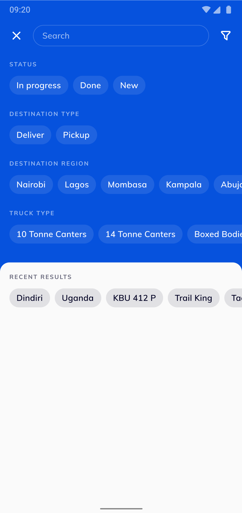
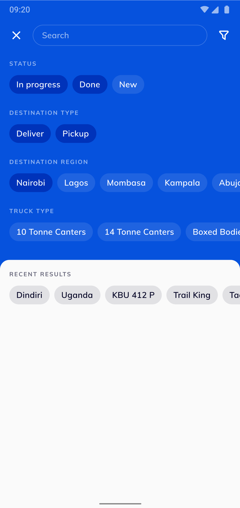
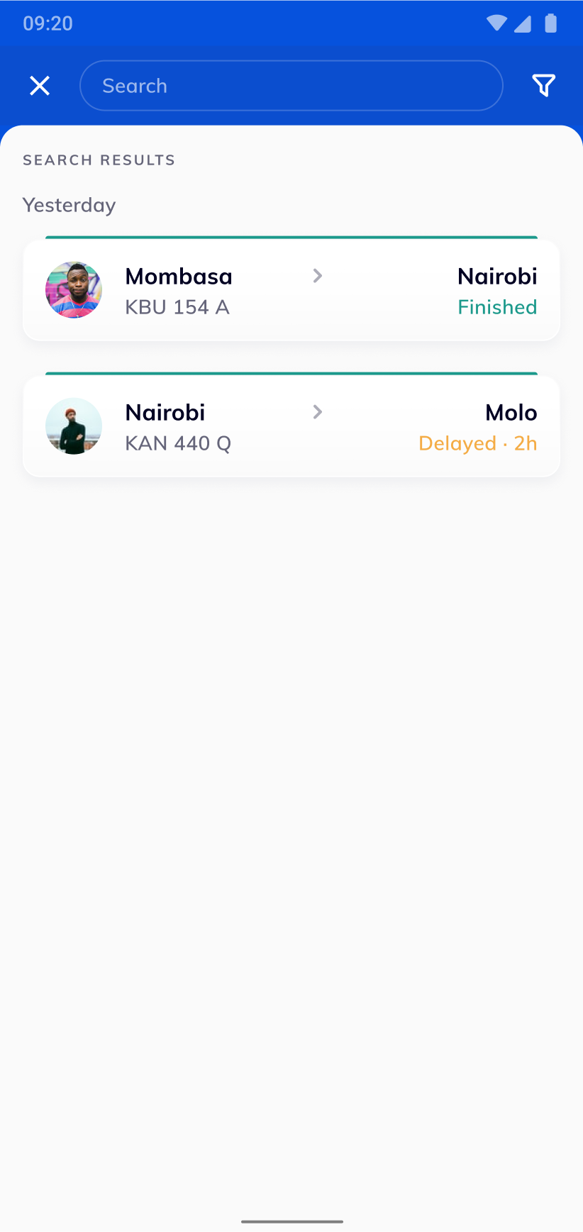
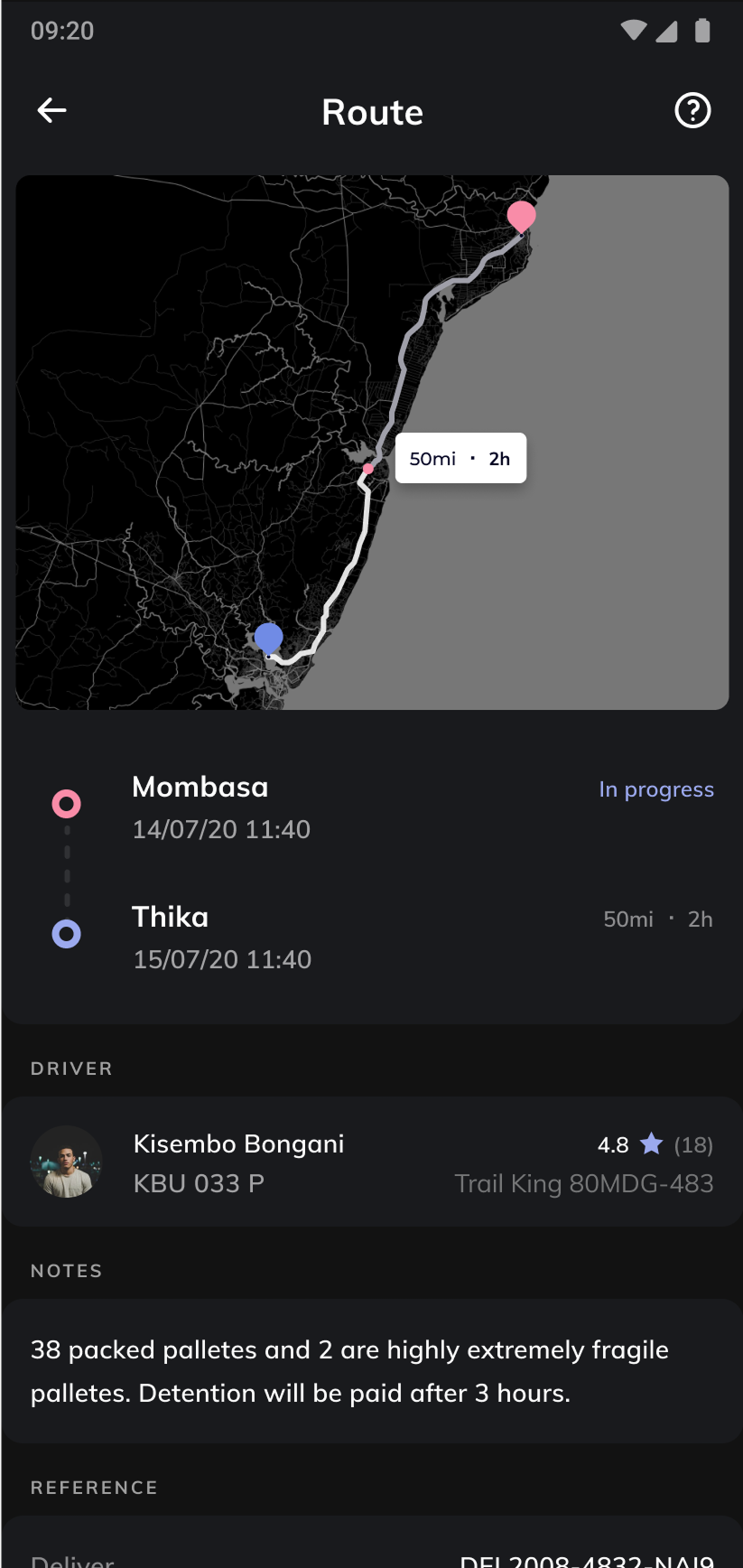
From the brand assets I built a full Android UI kit that includes 25 Material based components and 10 product specific patterns (order creation wizard, status badge, map overlay, condition report form). Each component respected the 14dp baseline grid, and included dark‑mode variants that the client had explicitly requested.
The UI Kit was validated, I produced high‑fidelity wireframes, interactive prototypes, and finally the production screens, including a custom splash screen.
I worked hand‑in‑hand with the front‑end developers to ensure pixel‑perfect implementation and smooth performance on low‑end Android devices.
Design challenge
The new app had to follow Google's Material Design guidelines while still looking unique and culturally relevant. It needed a visual language that felt modern and trustworthy, a logo that moved away from the generic “Musli” typeface toward a more geometric, African‑inspired mark, and a reusable component library that would work well on the dominant Android platform (about 88 % of users). At the same time, the interface had to present complex logistics data—order status, route maps, condition reports—in a way that anyone could understand, even if they were not technically savvy.
Components overview
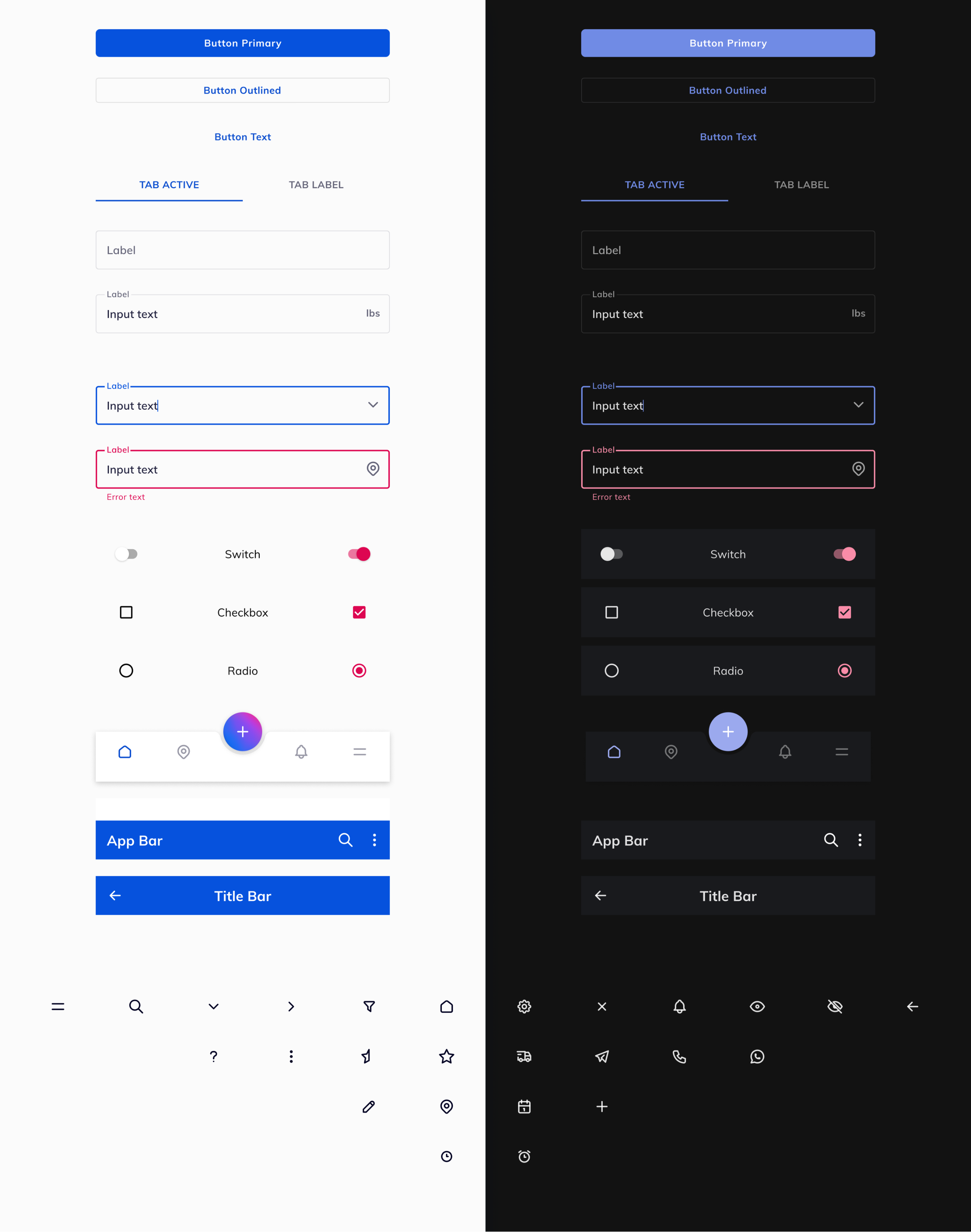
Dark mode
Results *
- -70%
- Cargo damage incidents reduced
- 45%
- New active users
- ~50%
- Long delivery complains reduced
* All metrics measured 6 months post-launch across Nigerian and Kenyan operations.
** Baseline data collected Q4 2019 via client operations system and user research questionnaires.
The Android application gave cargo owners a trustworthy, data‑rich experience, strengthened brand loyalty, and helped the logistics company move closer to its mission of lowering freight related costs across the continent.