Story
I went from stopping the constant rebuilding of tables, to creating a reusable UI library, to turning that foundation into a product that helped close multi-million-dollar deals in half the time.
Offer & Order UI
Business challenge
FLYR's ambition was to become a modular airline‑retail platform – a single, reusable stack that could power everything from capacity‑management dashboards to a full‑fledged shopping‑cart experience for passengers. Without a common back-office UI foundation, each new retail module required a fresh round of design, front‑end code, and QA, inflating delivery schedules and eroding the consistency that premium carriers expect. The stakes were concrete – the Riyadh Air partnership hinged on delivering a shopping‑cart‑enabled booking flow within a year, and the company's recent $295 M financing round was predicated on proving that FLYR could ship such modular experiences at scale.
Design challenge
How could FLYR give product teams a plug‑and‑play UI toolkit that supported every retail scenario without rebuilding basic controls each time and staying consistent with the rest of the FLYR' back-offices.
How to turn chaos into a single source of truth for both design and code, while keeping the system flexible enough.
My Contributions
Coordinated a cross-functional team (designer + two front-end developers), making sure priorities matched company goals and that visuals and UI layouts stayed consistent.
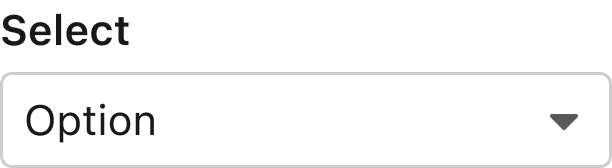
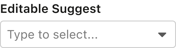
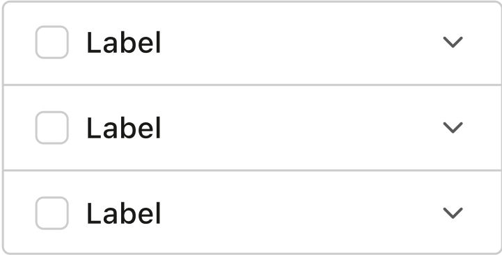
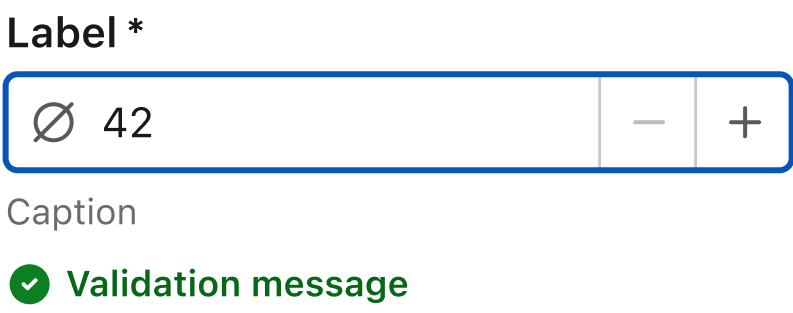
Assembled and delivered the retail‑ready UI components and led designer in building pattern library. Together with the product team we defined high‑level patterns — Shopping Cart, Product Catalog, Ancillary Selector, Order Search — that compose the core level components.
The design system embodies standards from across an organization.
But doesn’t necessarily define them or own those standards.
Takeaways
Using the Wilbur components and patterns, the entire booking experience (search → seat selection → cart → payment) was assembled in under 6 months, well ahead of the contractual deadline.
The rapid delivery of the modular retail flow was highlighted in the public announcement of the Riyadh Air partnership and reinforced investor confidence that helped secure the $295 M equity‑and‑debt raise.
With component and pattern documentation in place, designers and engineers now locate implementation solutions in seconds rather than days, giving product teams extra bandwidth to innovate on pricing, personalization and other revenue streams — core drivers of FLYR's growth.
“We will be at the forefront of innovation when it comes to booking travel experiences”.
“Riyadh Air will be the world's first "digitally native" airline”.
“Together, Riyadh Air and FLYR are transforming the passenger experience with shopping cart capabilities for passengers at every touch point".
Results
“Offer & Order: Built Right. Designed to Deliver.”
The Riyadh Air modular retail product was shipped in time, enabling the airline to be the first "digitally native" carrier to launch a full shopping‑cart experience.
Wilbur Design System
Seeded the design system in 2021. I extracted reusable atoms from existing screens, codified them as design tokens (colors, spacing, typography) and built the Figma components library.
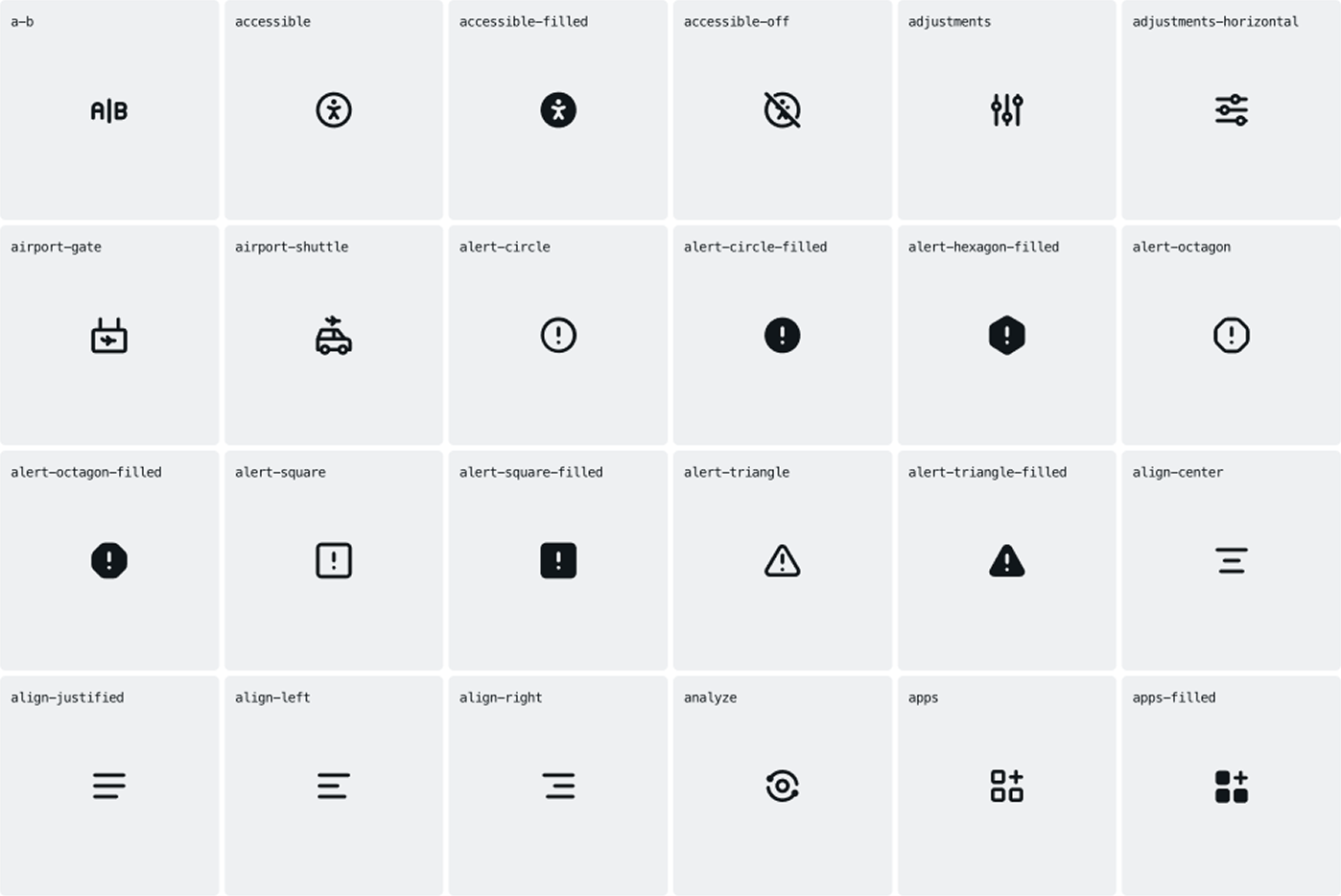
The results were presented to leadership, advocating for a dedicated design system team. The proposal received approval, leading to the hiring of a new designer. Together with two additional developers, a four‑person core team expanded the library to 50 core React ↔ Figma components, a set of 380 icons as a library, and broader web libraries for data visualization and feature‑specific subsets, ultimately reaching 750 components and 80 patterns in total.
The Wilbur design system turned a fragmented UI landscape into a modular, reusable retail platform, allowing FLYR to deliver a world‑class digital booking experience for Riyadh Air, accelerate time‑to‑revenue, and underpin the company’s multi‑hundred‑million‑dollar financing round.


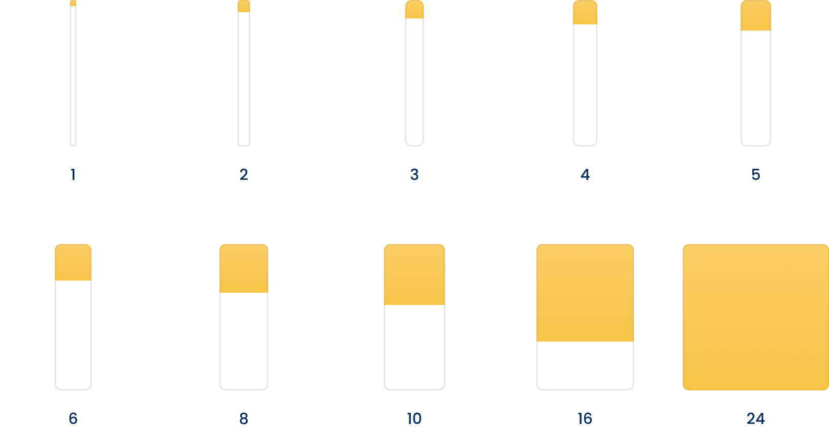
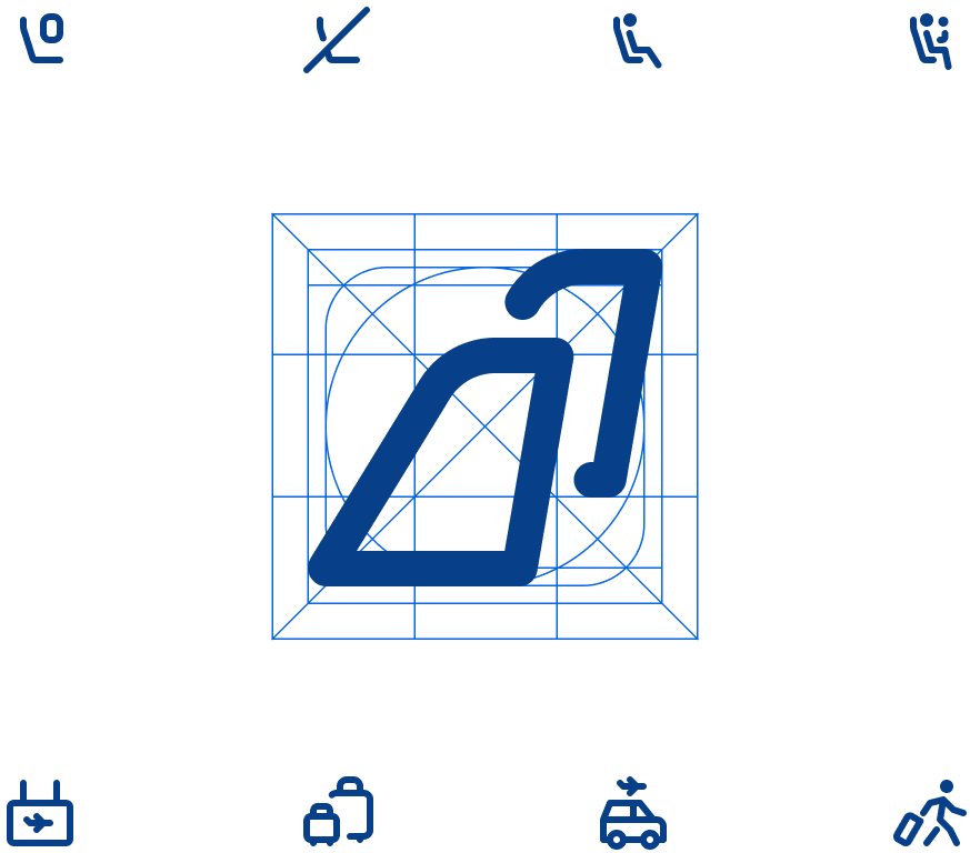
4pt grid system
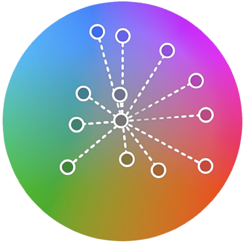
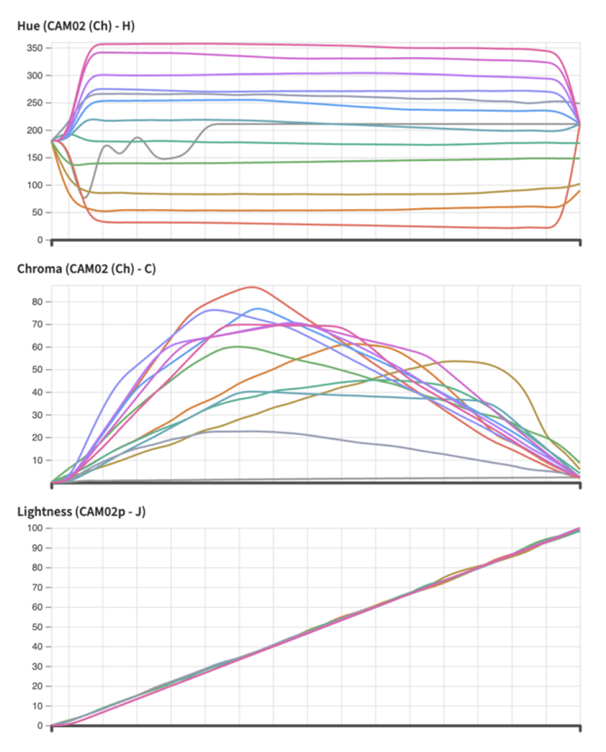
CAM02 (Ch) color space
This model shows color the way we actually see it in different lighting, backgrounds, and surroundings. In CAM02, the distance between colors matches how people really notice color differences, and it adapts to light by considering white point, brightness, and how our eyes adjust — something sRGB, HSV, and Lab do not do well. It also keeps hue steady when light changes, while chroma reflects how strong or colorful a tone looks in real life.
Icon library
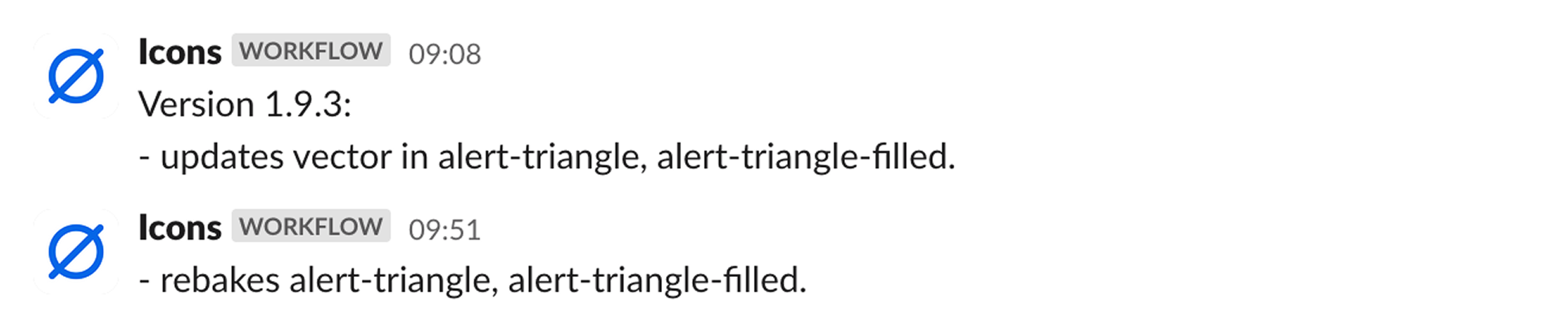
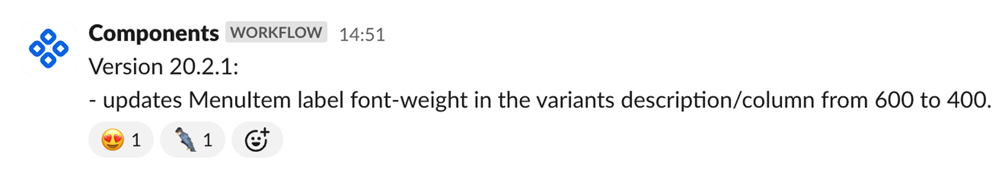
Published living documentation. Confluence, Zeroheight, Storybook portals give designers, developers and product owners a searchable catalogue of components, usage examples and version history, eliminating the need for ad‑hoc tickets.
Team mission
Shared Language
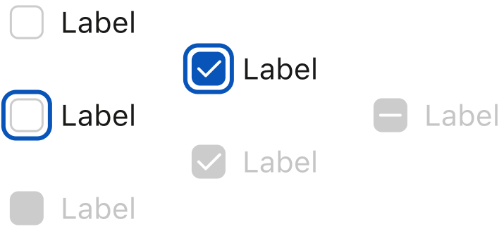
Defines interactive states, compound components, named slots, design token semantics, colors, and how consumers can apply them
- rest
- hover
- pressed
- dragged
- focus
- disabled
- read-only
- inactive
- trailingVisual
- leadingVisual
- icon
- text
- neutral
- primary
- success
- warning
- danger
- min
- weak
- medium
- strong
- max
- bg
- icon
- text
- border
- shadow
Dev ↔ Design ↔ Product
The system runs on proven and well-organised processes. Designers and engineers can add new components or improvements by following clear rules, and a strong priority system decides what to work on first based on impact, effort, and long-term goals.
Old components are removed in a planned way with clear instructions on how to update them. Every change goes through a formal request and peer-review process. Releases are done in stages through automated pipelines, and the documentation is updated each time, giving clear guidance for future changes.


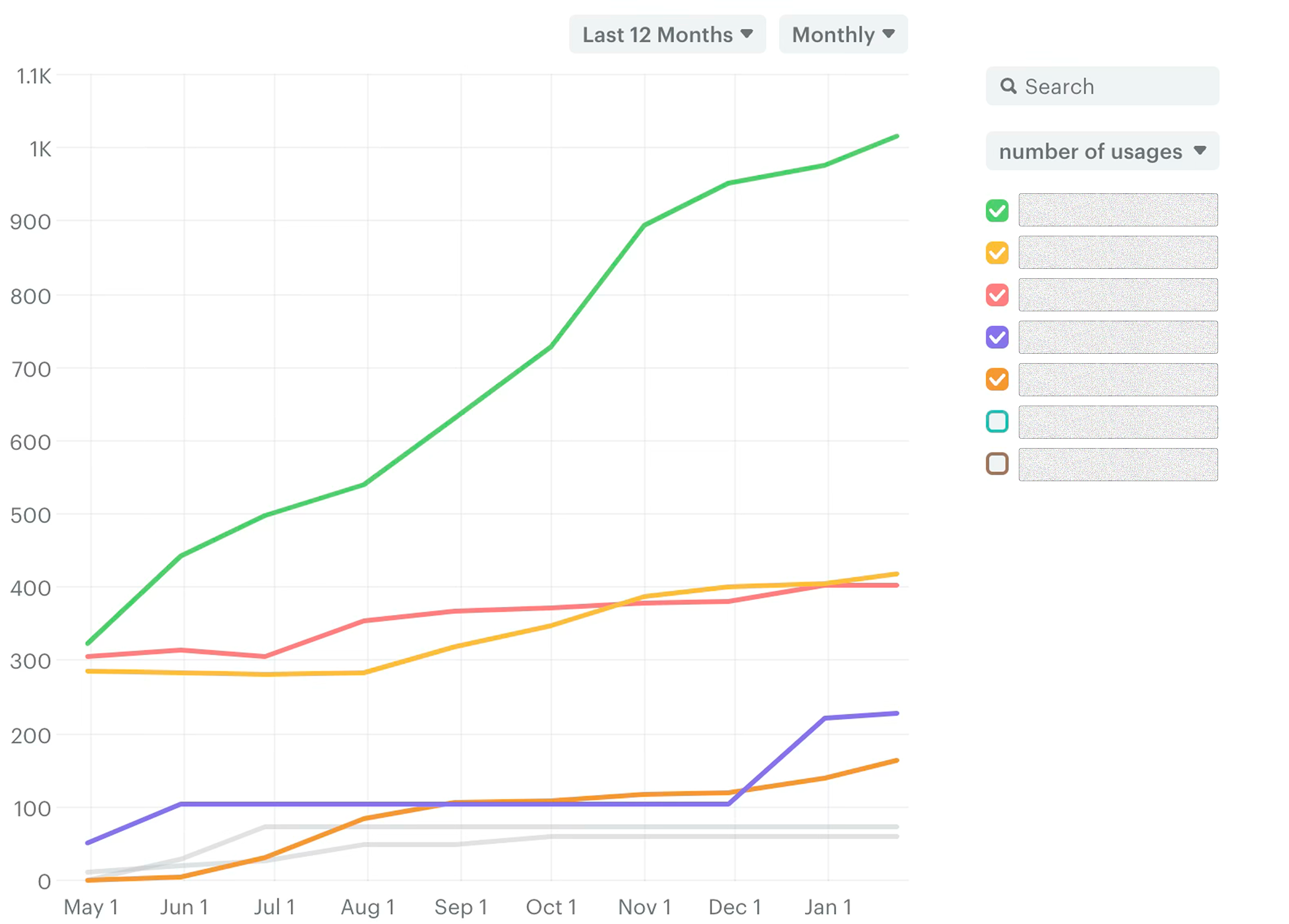
Documented with Storybook and supported with Omlet.dev statistics.


Results
The design system was repositioned as an independent product, its roadmap and release schedule were defined, a dedicated budget was secured, and an additional designer was hired. Today, every new FLYR product — including Modern Retailing — relies on the Wilbur Design System.
The system now provides a reliable, scalable foundation that speeds up development, cuts down inconsistencies, and unifies the entire company around a common visual language. This milestone also played a key role in helping FLYR secure the partnership with Riyadh Air.
Let's work together
Got an interesting challenge? I'd love to hear about it.
Gave creative teams back full control over their files

Turned airlines data into precise pricing and seamless decisions

Increased therapist booking conversions
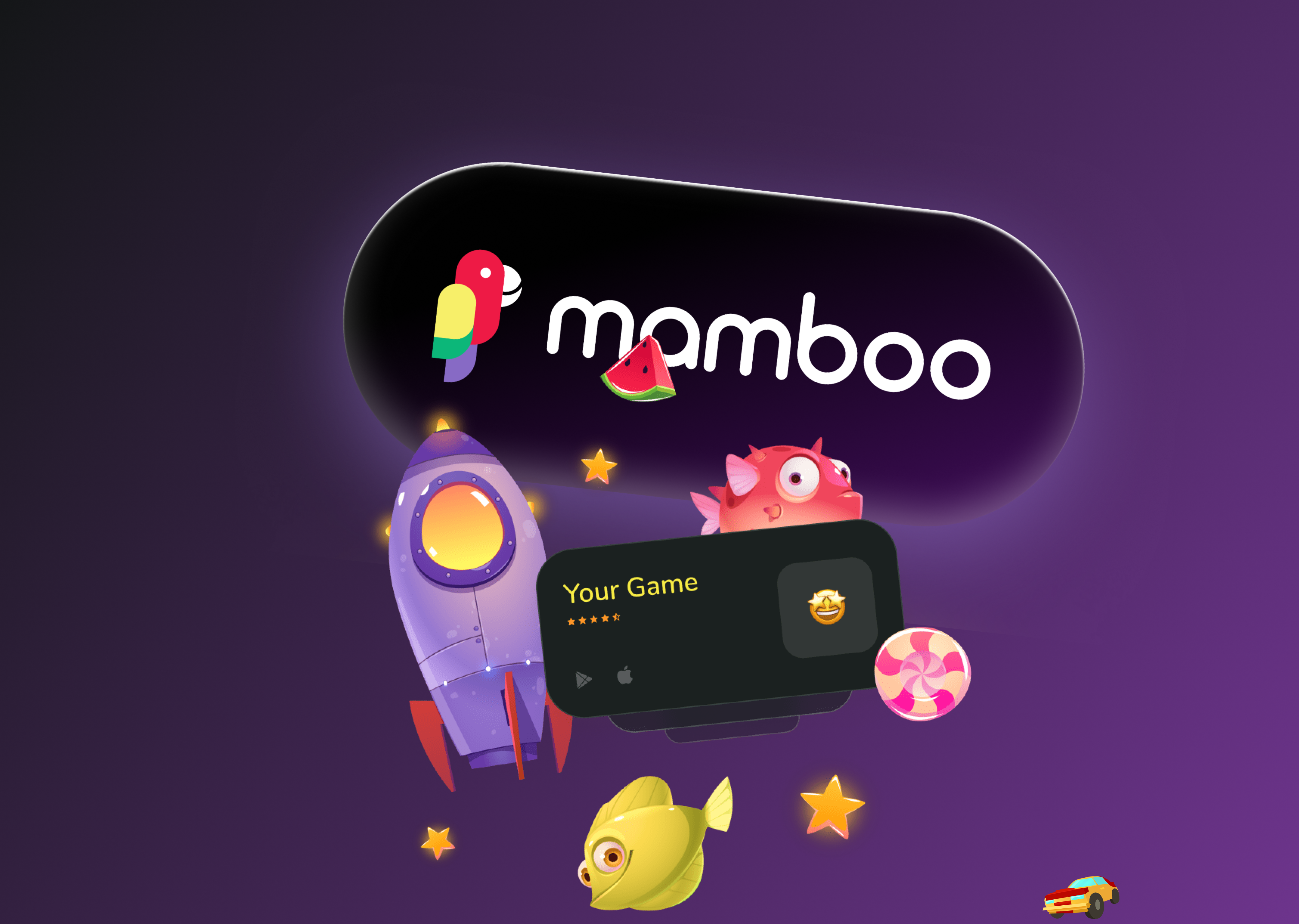
Converted indie game developers into leads

Omnichannel Contact Center
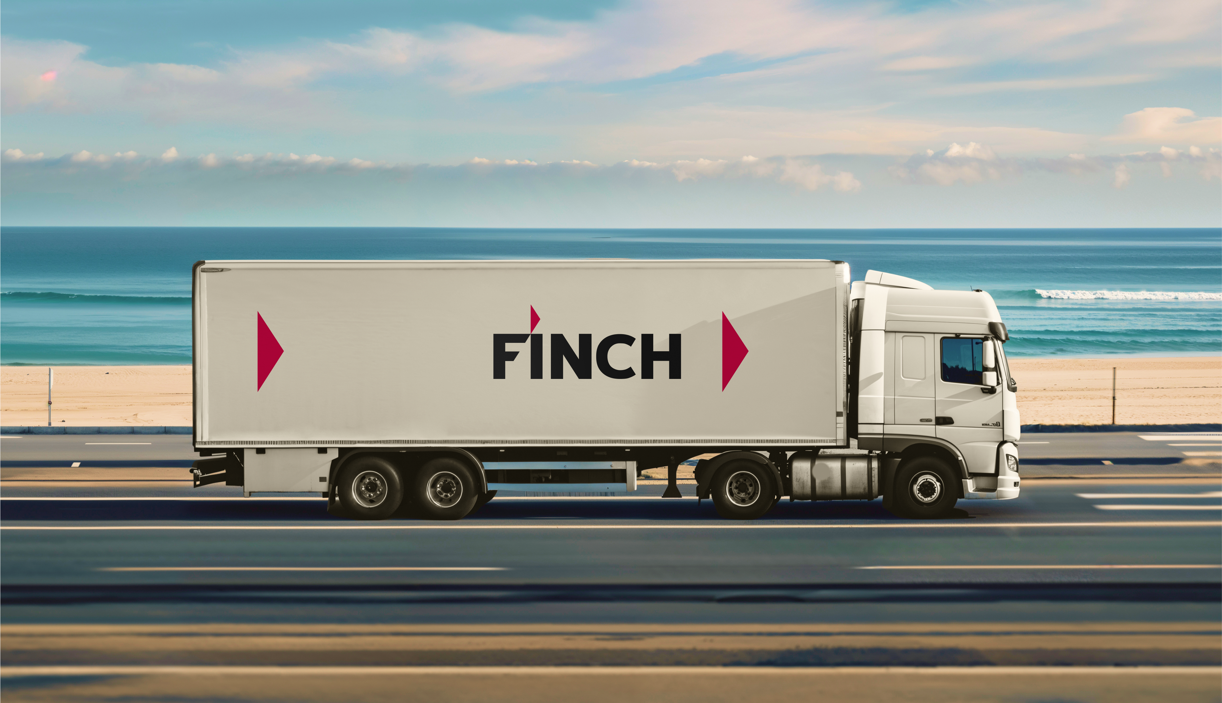
Identity, branding and application design for Finch Cargo

Web app for HEXA

Reduced operational costs for insurers