Business challenge
Give couples a digital space where they could explore their relationship through data‑driven insights. Existing self‑help apps were either overly generic or required users to interpret raw numbers without guidance, which led to low engagement and high abandonment rates. For the product to succeed it needed to turn complex questionnaire results into clear, actionable feedback, encourage honest participation from both partners, and provide a seamless path to professional help when needed. In short, the app had to create genuine self‑awareness while feeling safe, inviting and trustworthy.
Design challenge
The interface had to present dense psychological data in a way that was instantly understandable for people with no specialist knowledge. Second, the visual language had to respect Google's Material Design hierarchy and accessibility standards while also feeling warm and intimate enough for a relationship focused experience. Finally, the solution needed to be built on a reusable system so that future features such as new questionnaire modules or therapist booking flows could be added without redesigning the whole UI.
Story
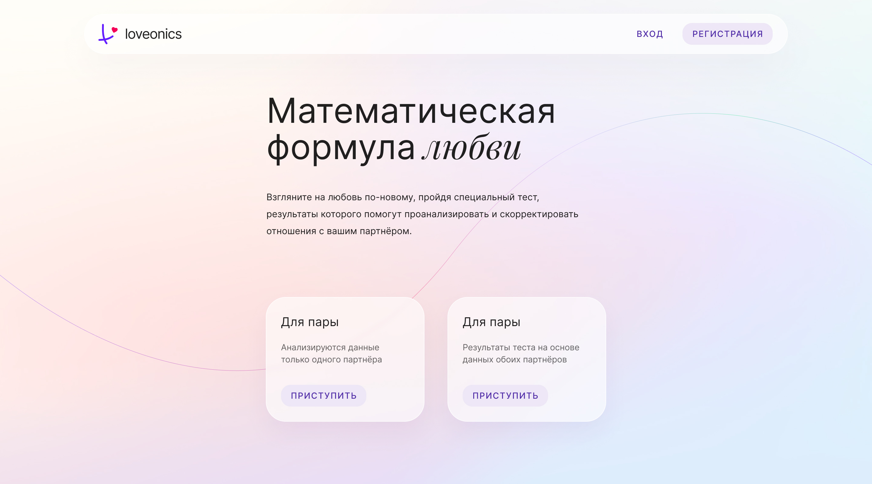
I led the design effort together with another designer. We began by shaping the brand identity: a logo that combined interlocking shapes to suggest partnership and balance, and a visual concept that blended Material's crisp grid and tactile cues with soft, multi‑tone gradients and a muted color palette. Those choices gave the product a clean, modern backbone while adding the warmth needed for a couple‑focused service.
From the brand assets we build a design system composed of 25 reusable components — buttons, cards, progress rings and modal dialogs — and 10 product‑specific patterns such as a dual‑user questionnaire wizard, a side‑by‑side comparison view, and a therapist booking overlay.
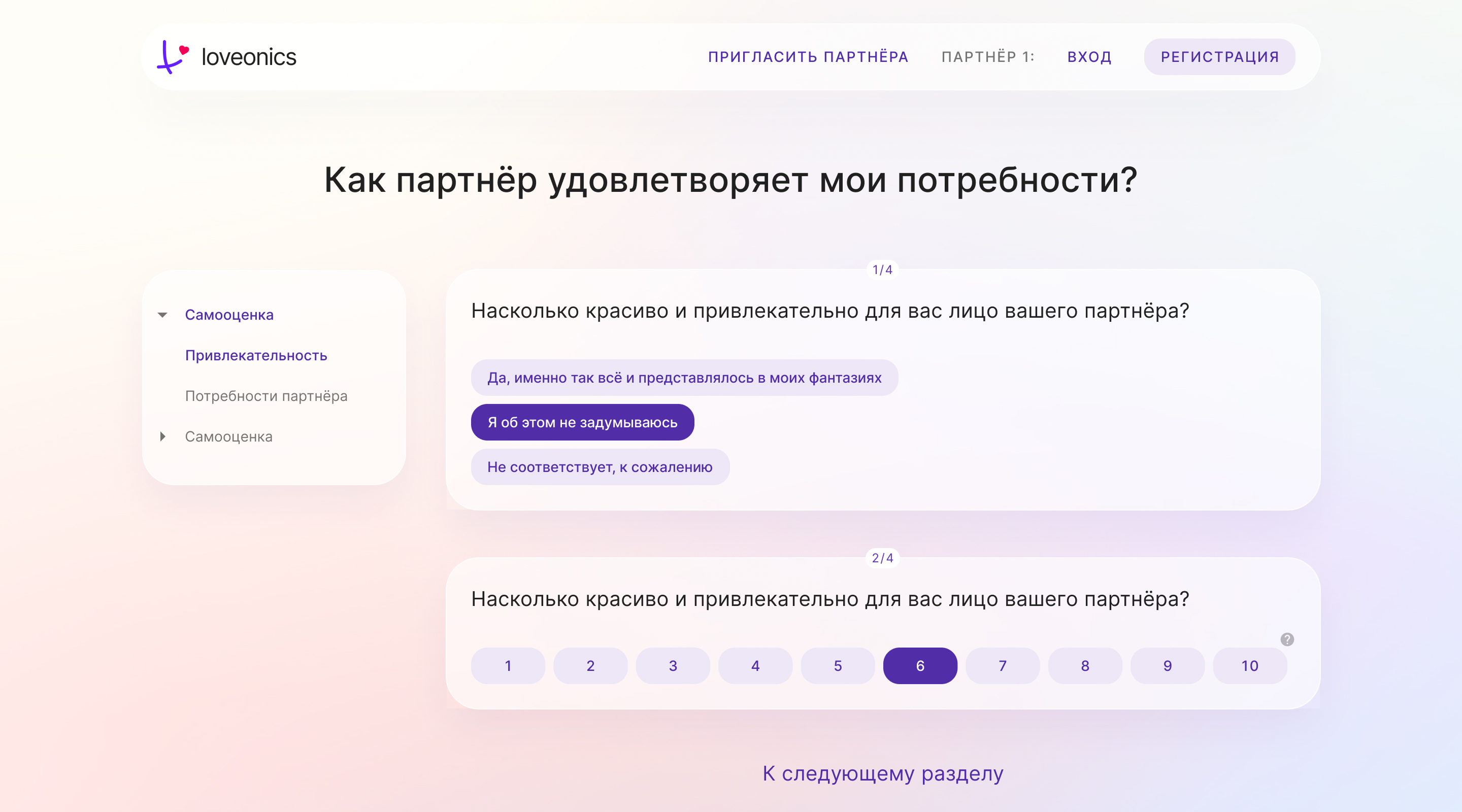
The system enforced consistent spacing, typography and interaction feedback, and it incorporated subtle shadows and fluid motion to convey depth without distracting the user. Working hand‑in‑hand with the lead front‑end developer, we translated the system into code, ensuring that every component behaved identically on phones, tablets and desktops and met WCAG accessibility thresholds.
Results
These gains translated into faster feature delivery, lower maintenance overhead and a product that feels both trustworthy and inviting—key factors for sustaining long‑term growth in the relationship‑wellness market.