Business challenge
Our team set out to bring a unified digital insurance hub to the local market. At the time customers still relied on separate insurer websites, phone operators and paper forms, which forced them to re‑enter the same personal data for each policy. Insurers were also looking for ways to cut the high operational cost of manual underwriting and claims handling.
The core obstacle was integration: most insurance providers did not expose public APIs, so convincing them to connect to a new platform required a clear demonstration of aded value. In addition, there was no proven revenue model for a consumer‑facing insurance portal, making long‑term financial sustainability uncertain.
Design challenge
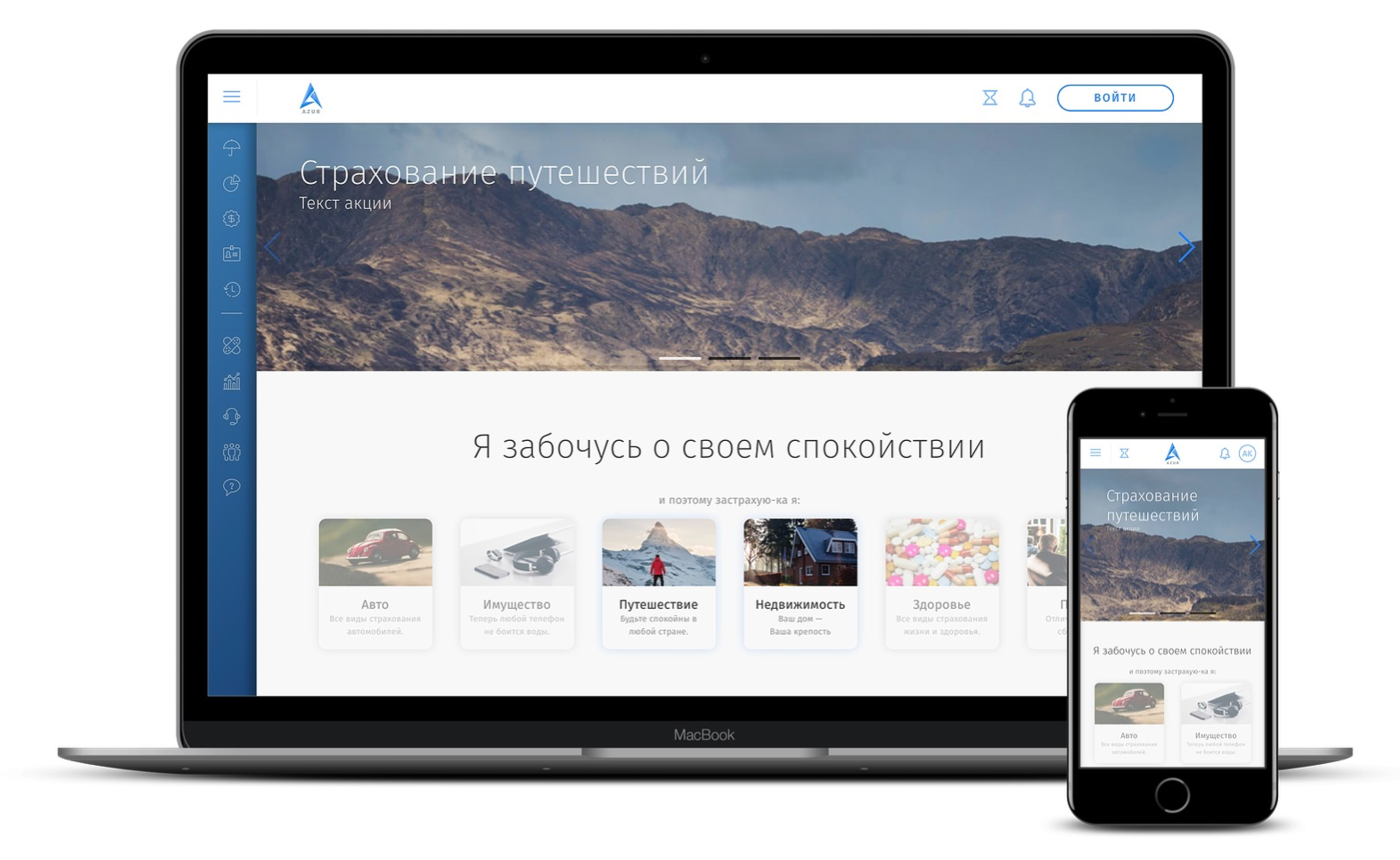
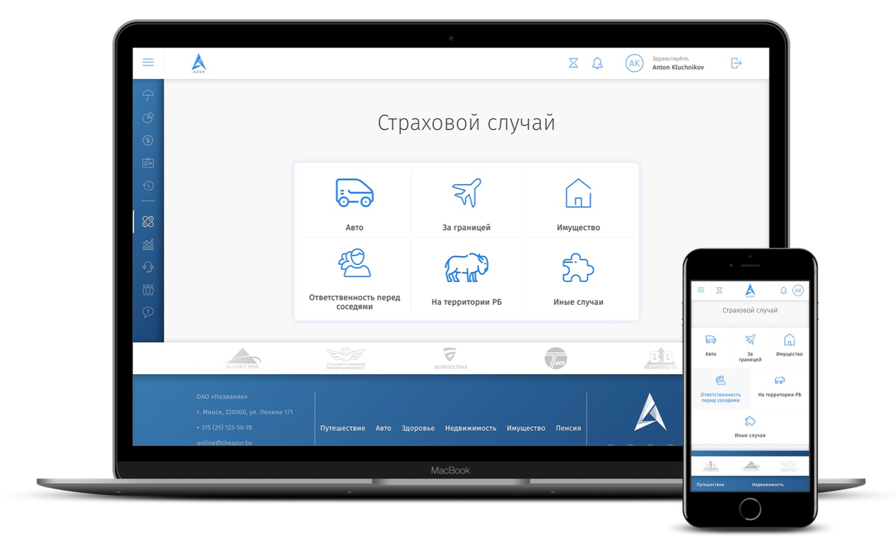
The product had to let users compare tariffs, purchase a policy and manage it later with a single, transparent interface. The comparison view needed to present complex coverage terms without overwhelming the visitor, while the checkout flow had to collect the necessary personal information once and reuse it for future transactions. The design had to work flawlessly on desktop browsers as well as on small screens, preserving brand consistency for multiple insurance partners who each wanted to display their own logo and color scheme.
Story
We began with stakeholder interviews and a series of user workshops that produced detailed journey maps and personas. Those insights fed a lightweight component system built around reusable Vue components: tariff cards, dynamic forms, modal dialogs and a theming layer, allowing each partner's branding to be swapped without breaking the overall look‑and‑feel.
To bridge the gap with insurers, we created a thin adapter layer that translated our internal request format into the various legacy protocols used by the partners. This approach reduced the integration effort for each insurer and made the value proposition clearer.
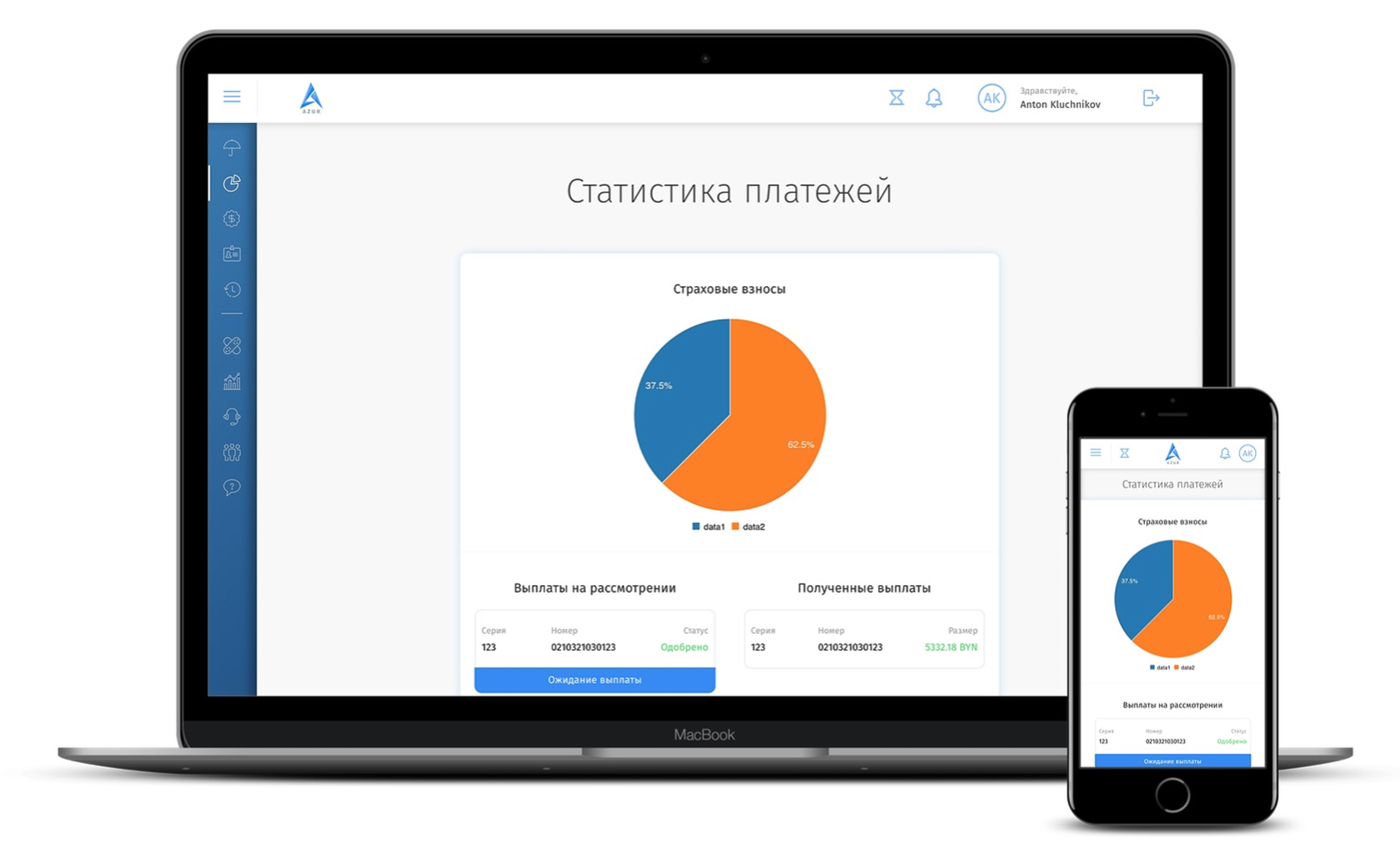
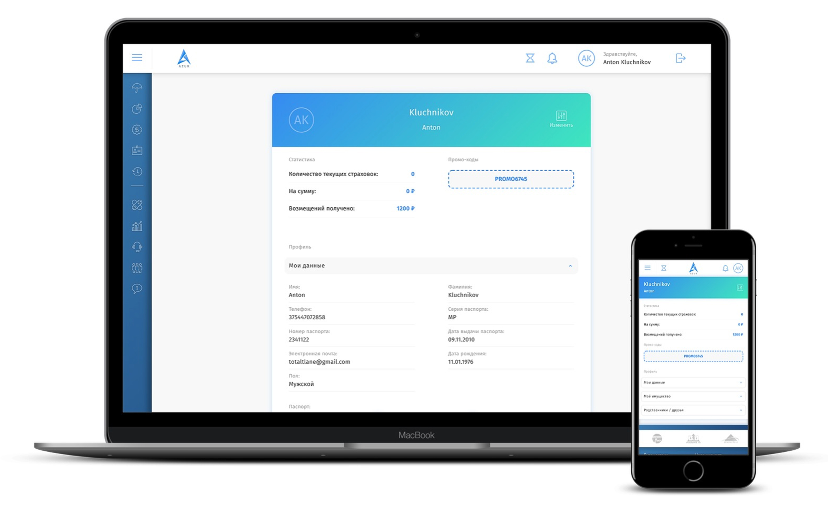
After beta launch with 3 local insurers, we gathered real usage data, refined the UI, and rolled out additional features such as document upload and automated reminders for upcoming payments.
Ran a social-media marketing campaign (Instagram, YouTube) in collaboration with travel bloggers, driving 8% of new registrations through referral links.
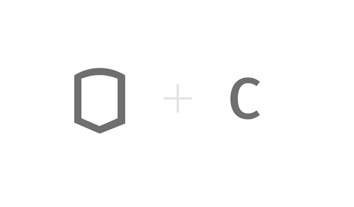
Logo

Shield shape combined with the letter "C" from "Compare" — a visual shorthand for protection and trust that insurance promises.
Colors
Results
During the 12 month pilot the platform attracted a modest but engaged user base of roughly 200 active accounts, with about one 800 completed policies. The conversion rate from tariff comparison to purchase reached 15%. It was well above the regional average at the time. Insurers reported a reduction of manual processing time by approximately 30% thanks to the automated data capture and the integrated B2B dashboard.
The partnership network grew from the initial 3 insurers to 5 by the end of pilot cycle, and the platform generated a commission based revenue stream that exceeded the internal target for the first year.